Donation Page Optimization: 15 Ways to Increase Completed Donations

Content authorSnoika FoundationPublished onReading time12 min read
A symmetrical diagram comparing two concepts with simple icons, arrows, and a cool blue and white color palette, excluding specific text.

This article walks through 15 specific changes that increase completed gifts on a donation page, from the giving case at the top to the receipt at the end. It also explains how to rank those changes and test them against your own donor data instead of borrowing someone else's conclusions.

Interested visitors are not the problem

Donation page optimization starts with a number that stings. On the average nonprofit main donation page, 11% of desktop visitors and 8% of mobile visitors complete a gift, according to M+R's 2026 Benchmarks. The other nine in ten arrived on purpose. They clicked a donate button or an email link, and then they left.

People who reach a giving form have already agreed with you in principle. What stops them is everything between the decision and the confirmation screen, and most of it is fixable without a redesign.

The 15 changes below are ordered the way I'd audit a page during donation page optimization: message first, then friction. Treat them as candidates for testing.

Donation page optimization baseline

Before touching the page, define what you're counting for donation page optimization. A completed donation is a transaction that clears payment and produces a receipt. Conversion rate is completed gifts divided by unique visitors to the page. Abandonment is the share of people who fill at least one field and never finish.

Two more numbers belong on the same dashboard. Average gift tells you whether a lift in volume came at the cost of revenue, and recurring-gift uptake tells you what the page is worth over years rather than minutes. Monthly giving already accounts for 31% of online revenue across the sector, so a page that converts slightly worse but recruits more monthly donors can still be the better page.

Then segment before you diagnose. The same page performs differently based on who lands on it, and an aggregate rate hides the thing you'd actually want to fix:

  • Device, because desktop average gift ran $137 compared to $83 on mobile in M+R's study, and mobile traffic behaves nothing like desktop traffic

  • Traffic source and campaign, since email clickers arrive warmer than paid social clickers and need less convincing

  • Donor type, separating first-time givers from people who already gave this year

Set a baseline window of at least four weeks per segment and write the numbers down. Everything that follows gets judged against them.

Strengthen the giving case

Informational graphic on optimizing nonprofit donation pages, featuring icons and sections in a clean, modern vector design with a blue palette.

Friction gets most of the attention because it's easy to spot. But a fast, clean form still fails if the visitor can't tell what their money does or why this organization is the one to do it. Tim Kachuriak, founder of the fundraising research lab NextAfter, put it plainly on the Bright Spot Fundraising podcast: "If your donation page does not answer that essential question, that value proposition question, then you're going to lose."

Start here because message changes are cheap and their effects are large. They also shape which of the later fixes matter. A page with a weak case needs more copy in donation page optimization. A page reached by donors who already decided needs less, which is why importing generic nonprofit donation page best practices without testing them backfires so regularly.

Clarify message hierarchy

The need and the ask have to be obvious within a second of landing. Your history and program list are supporting material that belongs lower on the page or behind a link.

NextAfter's experiment library is unkind to pages that bury the ask. Removing a video from one donation page produced a 527% increase in donations, and nearly every video test in their library moved the same direction. The lesson is that anything competing with the form for attention has to earn its place in nonprofit donation page best practices.

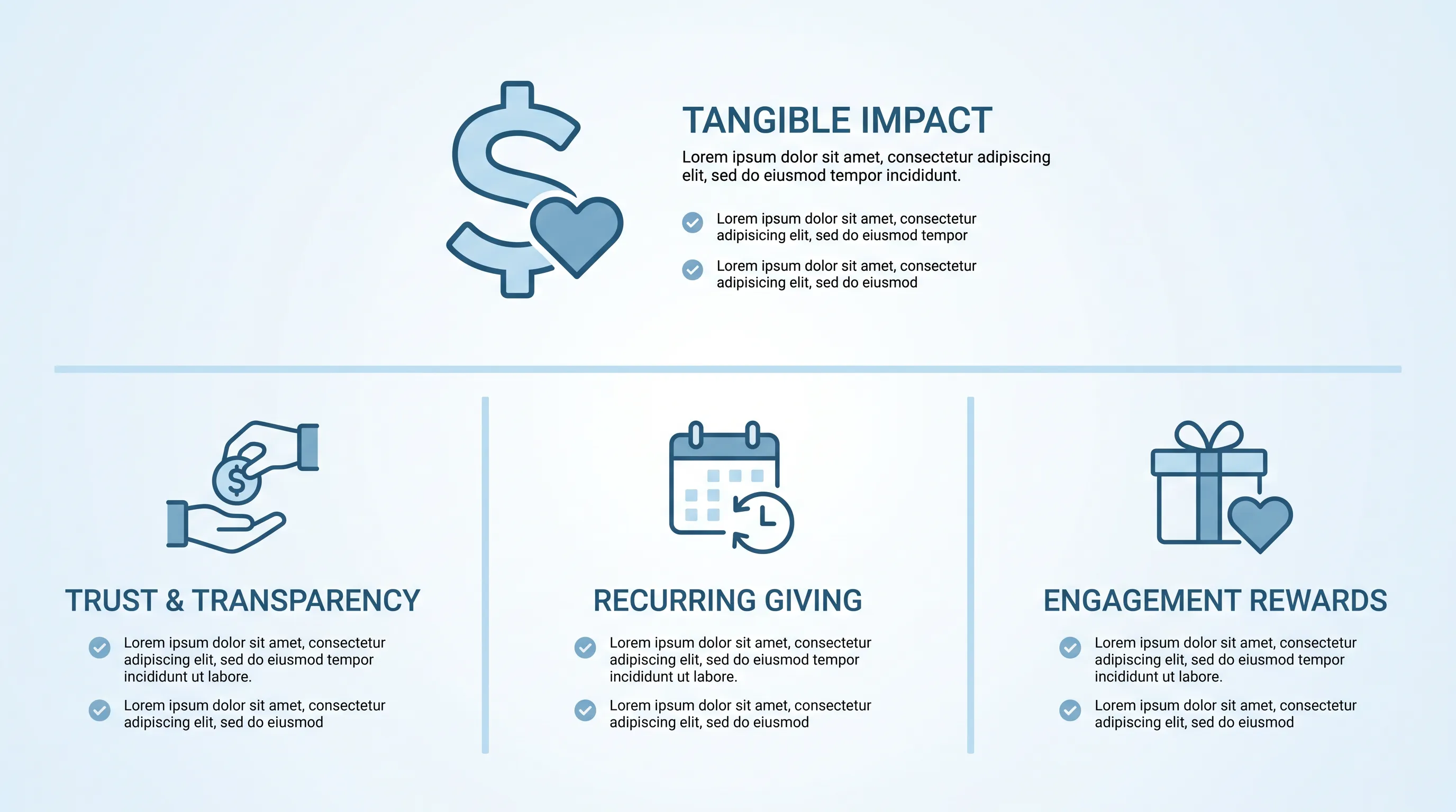
Show tangible impact

Quantified outcomes work. In experiments run with PayPal by the Golub Capital Social Impact Lab at Stanford Graduate School of Business, donation rates rose 45% when users saw a line describing what the gift accomplished, tested against a sample of 1.4 million checkout users. Statements that quantified the outcome beat statements that only described the mission.

The trap is inventing precision you can't defend. If your program cost per person served is a blended average across grants, say so in plain language. Credible specificity beats invented specificity, and donors who later learn the number was fiction don't come back.

Need help with your AI visibility?

Book a free consultation with our experts we'll help you determine exactly which services your organization needs.

Match campaign messaging

The appeal that generated the click made a promise. If the email talked about winter shelter beds and the donation page talks about your 40-year legacy of service, the visitor pauses to check whether they landed in the right place. That pause is where you lose them.

Carry the headline language and the specific ask straight through to the page. Campaign-specific pages beat a single general page for this reason, and they're also easier to measure for donation page optimization, because the traffic arriving on them shares one motivation.

Set suggested amounts

Pull your last 12 months of online gifts and look at the distribution. Amounts that no one chooses are wasted slots. When the Stanford team replaced an unpopular $75 button on PayPal's Giving Fund site in an experiment with more than 400,000 users, a higher $200 option raised more total revenue while a lower $10 option recruited more donors. Which one you want depends on your goal for that campaign.

Keep the custom-amount field visible rather than hidden behind a link in nonprofit donation page best practices. NextAfter's testing found that channels with an unusually high average gift can do better with an open field only, because a preset array anchors generous donors downward.

Offer recurring giving

Monthly donors are worth pursuing because they stay. Roughly 71% of new monthly donors are still active after 12 months, while overall donor retention across the sector sat at 43.3% in 2025 according to the Fundraising Effectiveness Project.

Present the monthly option as a clear toggle with a one-line reason it helps, such as predictable funding for ongoing programs. Whether to preselect it is a genuine open question, so test it. Preselection lifts recurring uptake on some pages and depresses total conversion on others.

Reduce donation friction

Once the case is clear, the remaining losses happen inside the form. Baymard Institute's checkout research, built on 16 years of usability testing, estimates that a large site can gain as much as a 35% increase in conversion from design changes to the checkout process alone. Giving forms are checkout forms with worse budgets.

The goal of donation page optimization, and of donation form optimization, is the shortest form that still collects what you need to process the payment and meet your reporting obligations.

Donation form optimization

Every field is a place to quit. When NextAfter tested removing a comment box and a fee-coverage option from Care Net's giving form, conversion went from 26.1% to 54.1%, a 107% lift at 99.3% confidence. The organization found other ways to collect that information later.

Use a single column in a predictable order from amount to payment for donation form optimization. Multi-column layouts and reshuffled sequences make people re-read. And if a field is genuinely required, explain why in a few words next to it, because Baymard found that 14% of users abandon checkout when a phone number is simply demanded without explanation. Real donation form optimization is subtraction plus justification for what survives.

Improve error handling

Errors are inevitable, so the question is how the form behaves when one happens. Baymard's benchmark shows that 31% of sites have no inline validation at all, which means the donor discovers the problem only after submitting. Validate when someone leaves a field.

Then make the message say what's actually wrong. Only 2% of sites use error messages targeted at the specific problem, so 98% show something generic even though the back end knows the cause. Worse, 34% of sites clear the card fields after a validation error, and Baymard observed participants abandoning rather than retyping their card number.

Need help with your AI visibility?

Book a free consultation with our experts we'll help you determine exactly which services your organization needs.

Expand payment methods

Digital wallets remove the worst part of mobile giving, which is typing 16 digits with your thumb. Adoption has moved fast: 79% of nonprofits accept PayPal and 57% accept Apple Pay in M+R's 2026 data. Wallets also autofill name and email, which shortens the form you just worked to shorten.

Bank payments deserve consideration for larger gifts because processing fees don't scale with amount. Don't add methods indiscriminately, though. Baymard found that 10% of shoppers abandoned a checkout over a missing preferred option, which argues for covering real demand.

Add trust signals

The payment step is where doubt arrives. Keep your logo and colors identical to the site the donor came from, and put a lock icon and a plain-language security note beside the card fields. A phone number and a physical address near the form do more for credibility than a badge nobody recognizes.

Third-party validation helps when it's specific in nonprofit donation page best practices. A charity rating or an audited financial statement gives a first-time donor something to check. Vague reassurance does nothing.

Remove competing actions

Your main navigation exists to help people explore. On a donation page, exploration is failure. Strip the header links and kill the pop-ups until the transaction is done.

The same logic applies to your own internal links in donation page optimization. A donor who clicks through to read about a program is a donor who has left the form, and most of them don't come back.

Improve the full experience

Message and form get you most of the way in donation page optimization. What's left is the plumbing, plus the moments right after payment that decide whether this gift becomes a relationship. These are the details that go unmeasured because they sit outside the page itself.

Design for mobile

Mobile donors are the majority of your traffic and the minority of your revenue. Build for one hand: tap targets big enough to hit without zooming and numeric keyboards on amount and card fields.

Then test on real devices. Emulators don't reproduce keyboard overlays covering the submit button or autofill behaving oddly in an in-app browser. Mobile-specific donation form optimization finds bugs.

Improve page speed

Speed compounds with everything else, because a form nobody sees converts at zero. In the Milliseconds Make Millions study Google commissioned from Deloitte and fifty-five, a 0.1-second improvement in mobile load time was associated with retail conversions 8.4% higher and spend 9.2% higher across 37 brands and more than 30 million sessions.

Measure with field data from real visitors. Compress and resize images, then run the full flow on a throttled connection to see what a donor on a rural signal experiences. Page speed is a core part of that experience in donation page optimization.

Meet accessibility needs

The state of the web here is poor. WebAIM's 2026 analysis of one million home pages found detectable WCAG failures on 95.9% of them, with missing form input labels on 51% and low contrast text on 83.9%. Both problems hit donation forms hardest, since a screen reader that can't name a field makes giving impossible.

For nonprofit donation page best practices, label every input properly and announce validation errors and submission status where assistive technology will read them. This work overlaps heavily with the error-handling fixes above, which is why it's cheaper than it sounds.

Keep the journey consistent

Sending a donor to a differently branded third-party domain costs gifts. Roughly one in six donors drops off when redirected to an external payment page, and embedded, custom-branded forms have been associated with six times as much money raised compared with off-site redirects.

When your platform can't be embedded, do what you can: match colors and logo, and warn the donor before the handoff. Silence plus an unfamiliar URL reads as a phishing attempt.

Improve confirmation experiences

Confirm the charge on screen immediately with the amount and whether the gift recurs. Email the receipt within minutes with your tax identification details, because donors file these and will email your staff if they can't find one.

Then say something worth reading. Tell them what happens next and roughly when they'll hear from you, and offer one relevant follow-up action such as sharing the campaign. One option. Confirmation pages are the most neglected item in most nonprofit donation page best practices checklists and the cheapest to fix.

Prioritize and test changes

Fifteen changes is too many to ship at once. Rank them by the strength of the evidence that something is broken and the number of donors who hit that step. A missing form label affecting every visitor beats a copy rewrite you feel strongly about.

Analytics tell you where people leave. They don't tell you why, so pair the funnel data with five or six sessions of watching real people attempt a gift on their own phones. Then test, with one hypothesis and enough data to trust the result.

Be prepared to be wrong. NextAfter hypothesized that hiding non-essential fields would lift donations and instead measured a 32% decrease at 89% confidence, a reminder that no tactic on this list carries a guaranteed lift. Your donation page optimization program is a sequence of local answers about your donors.

Get expert optimization help

Snoika Foundation audits websites for NGOs and nonprofits and turns the points where visitors stop before donating into a prioritized fix list that covers page performance and form structure. If your traffic is fine and your completed gifts aren't, book a call with our team for a diagnostic audit and a donation page optimization plan built on your own numbers.

Need help with your AI visibility?

Book a free consultation with our experts we'll help you determine exactly which services your organization needs.

Run a test until it covers a complete weekly cycle and reaches the sample size set before launch. Use completed gifts as the primary outcome, then check average gift and recurring uptake as guardrails. During donation page optimization, don’t stop a test after an early spike because random variation can reverse the apparent winner.

If completed gifts rise while average gift falls, compare total revenue per visitor before choosing a winner. A lower average gift can still produce more revenue when conversion increases enough. Also review recurring-gift uptake, since a higher monthly-donor rate changes the value of the page beyond the initial transaction.

Yes. The client can move optional questions, such as event interests or communication preferences, to the receipt page or a follow-up message. Keep payment confirmation separate from these requests, and make skipping them easy. Required information still belongs before submission when the payment processor or law requires it.

Compare first-time and repeat donors separately because they arrive with different levels of trust and knowledge. A repeat donor often needs less explanation, while a first-time donor needs clear identity and payment reassurance. Combining both groups can hide a message problem that affects acquisition without affecting existing supporters.

Yes, but separate the tax receipt from the stewardship message. Send the receipt with the amount, date, and tax details, then use a later message to explain what happens next. Track whether donors open, click, or give again, while keeping unsubscribe choices clear.

Book a Demo

Book a time that works best for you

You Might Also Like

Discover more insights and articles

Infographic with a glassmorphism style, featuring a 9-step process in three rows, with elegant blue-and-white icons and flowing connections.

How to Build AI-Ready Program Pages That Convert

This article explains how to rebuild a programme page as an AI-ready program page structure so that a prospective participant and a language model can work out in seconds what you do and whether it applies to them. It walks through a nine-block architecture and a publishing workflow you can run with a small team.

Modern infographic with soft blue gradient background, featuring four circular glassmorphism cards connected by subtle lines and icons.

Nonprofit Call to Action Examples for Donations, Volunteers, and Advocacy

This article is a working swipe file of nonprofit call to action examples you can adapt for donations and volunteer recruitment. It covers copy formulas and a simple testing method so you can replace vague asks with ones that actually get completed.

Modern B2B technology infographic with frosted-glass cards, soft blue gradient, and elegant connections, centered on "Brand Guidelines.

Nonprofit Brand Identity: How to Build a Consistent System Beyond the Logo

This article explains how to build a nonprofit brand identity that survives contact with reality: twelve staff members and no in-house design team. It covers the visual and verbal systems behind that consistency, plus the templates and governance that keep the whole thing alive after launch.

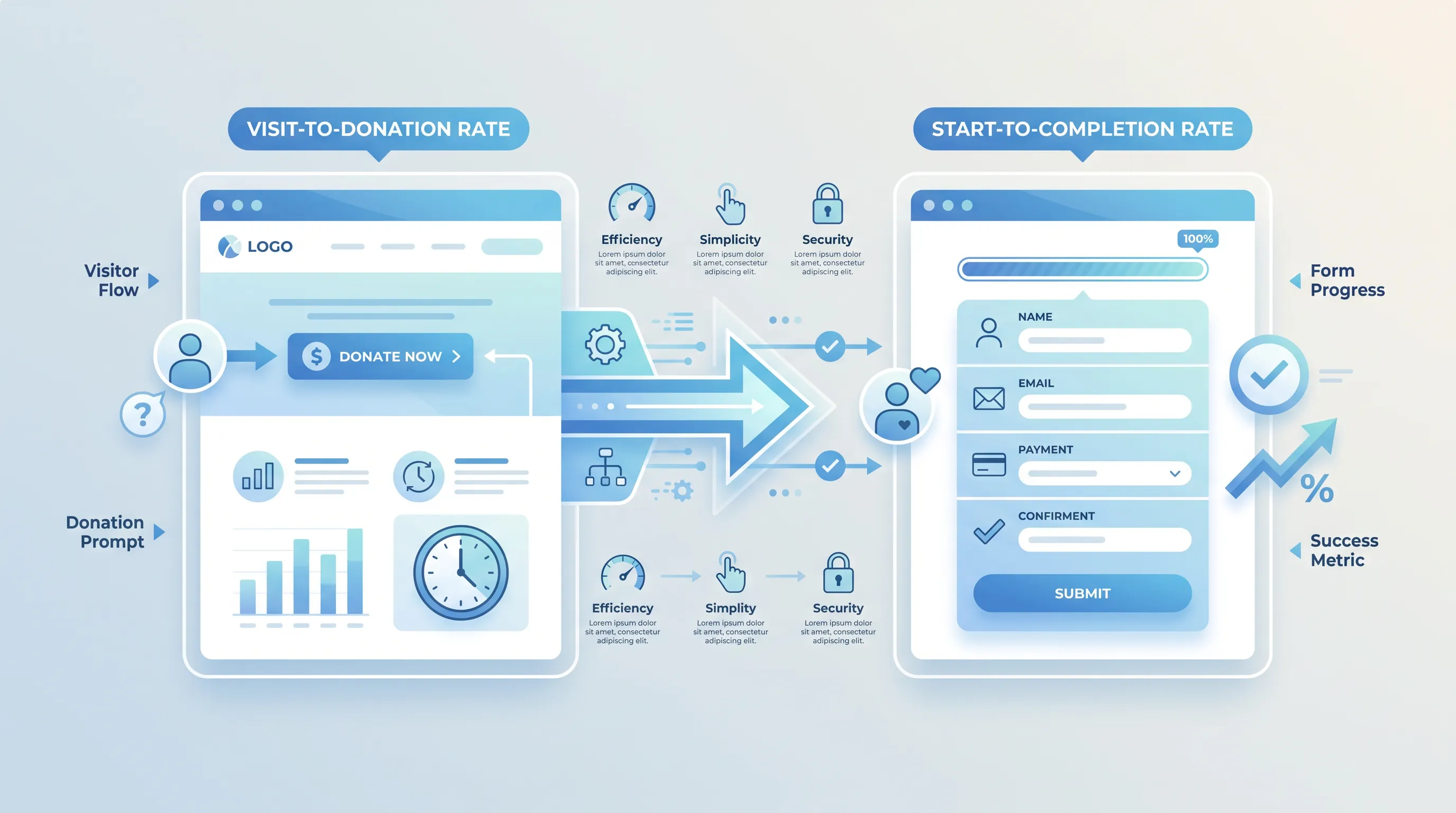
Flat design infographic comparing two donation website types: 'Visit-to-Donation Rate' on the left and 'Start-to-Completion Rate' on the right, with arrows i…

Donation Page Conversion Rate: Formula, Benchmarks, and Diagnostics

This article explains how to calculate and benchmark a donation page conversion rate without mixing up denominators. It walks through two formulas with worked numbers and a repeatable diagnostic sequence you can run before you change anything on the page.