Nonprofit Value Proposition: How to Explain Why Your Mission Matters

Content authorArtem LozinskyPublished onReading time10 min read
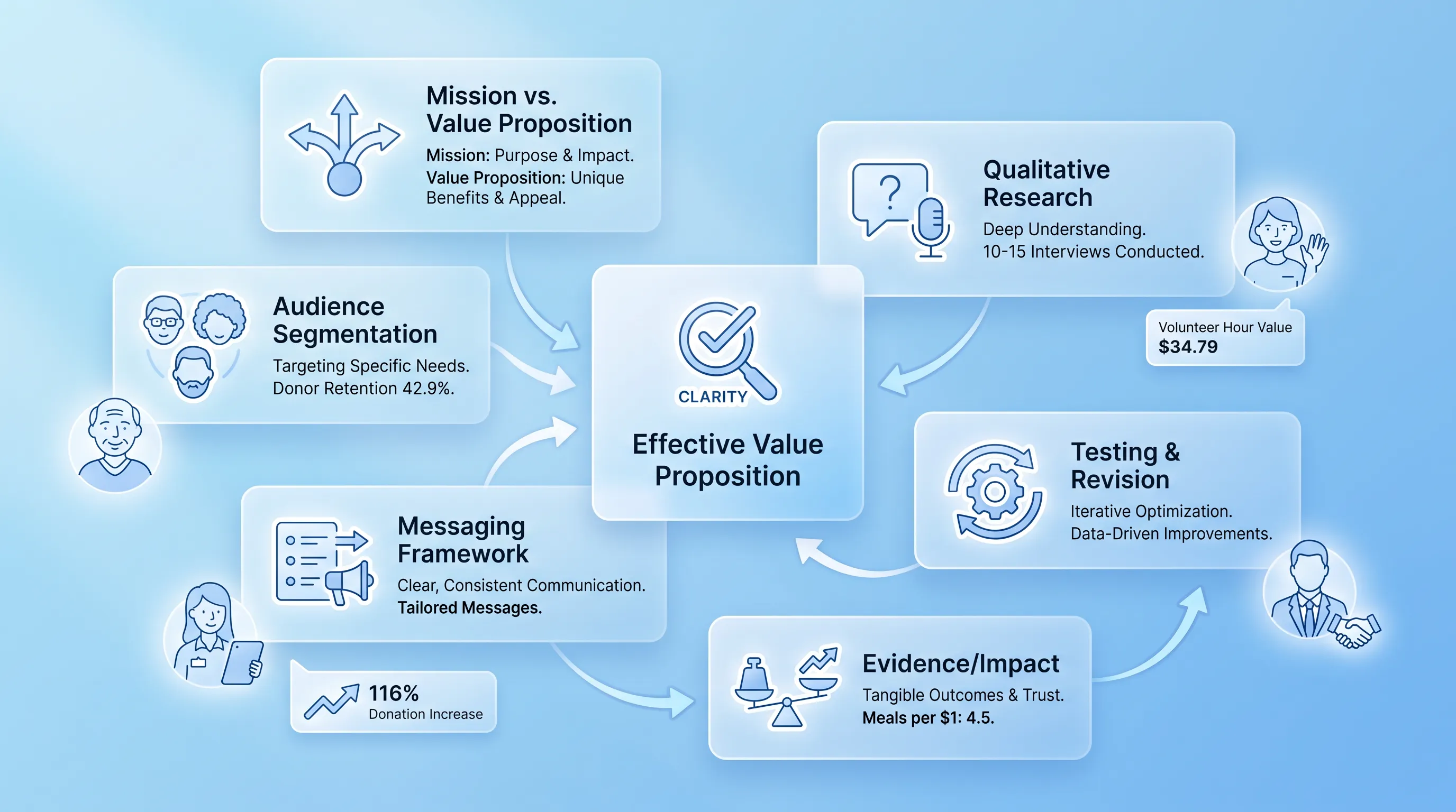
Infographic featuring a central translucent card labeled 'Effective Value Proposition' with surrounding semi-transparent cards for process steps and key stats.

This article walks through a practical way to turn broad mission language into messaging a specific person can act on. You'll get a one-page canvas and before-and-after examples for five audiences.

Why missions fall short

A nonprofit value proposition and a mission statement do two different jobs, and confusing them is the most common reason good organizations sound interchangeable. Your mission explains why you exist, written mostly for your board and your staff. The nonprofit value proposition explains why a particular person should give you their money or their Saturday.

Look at what happens when the two get merged. "We are dedicated to empowering underserved communities through holistic, sustainable programming" tells a first-time visitor nothing about what problem you solve or what changes because of it. There are 1,935,344 registered nonprofits in the United States, and a sentence like that describes a large share of them.

That vagueness has a cost. Donor retention in the U.S. fell to 42.9% in 2024, according to Fundraising Effectiveness Project data. People don't come back to organizations they can't describe to a friend.

Choose one audience

Every page and every campaign needs one priority audience. A message written for donors and beneficiaries at once ends up written for nobody. The moment you try to include everyone, you retreat to abstractions.

So pick the person whose decision that page exists to influence. Then go find out how they actually talk. Nathan Hill, then Vice President of Training at the research lab NextAfter, put the test simply: a nonprofit value proposition "answers one question" for the person reading it, and your best ideas are frequently not the same as your donors'.

The research needs a few hours and a willingness to hear something you didn't expect:

  • Ten to fifteen interviews with people in that one audience group, which is enough to reach saturation in most applied qualitative research

  • Verbatim donor comments from your giving forms and thank-you replies, kept in their original wording

  • Search queries that bring people to your site, which show the words they use before they know yours

  • What your intake staff and volunteer coordinators hear in the first two minutes of a conversation

Frontline staff are the underused source here. They hear the objection before it becomes a bounce.

Build a simple canvas

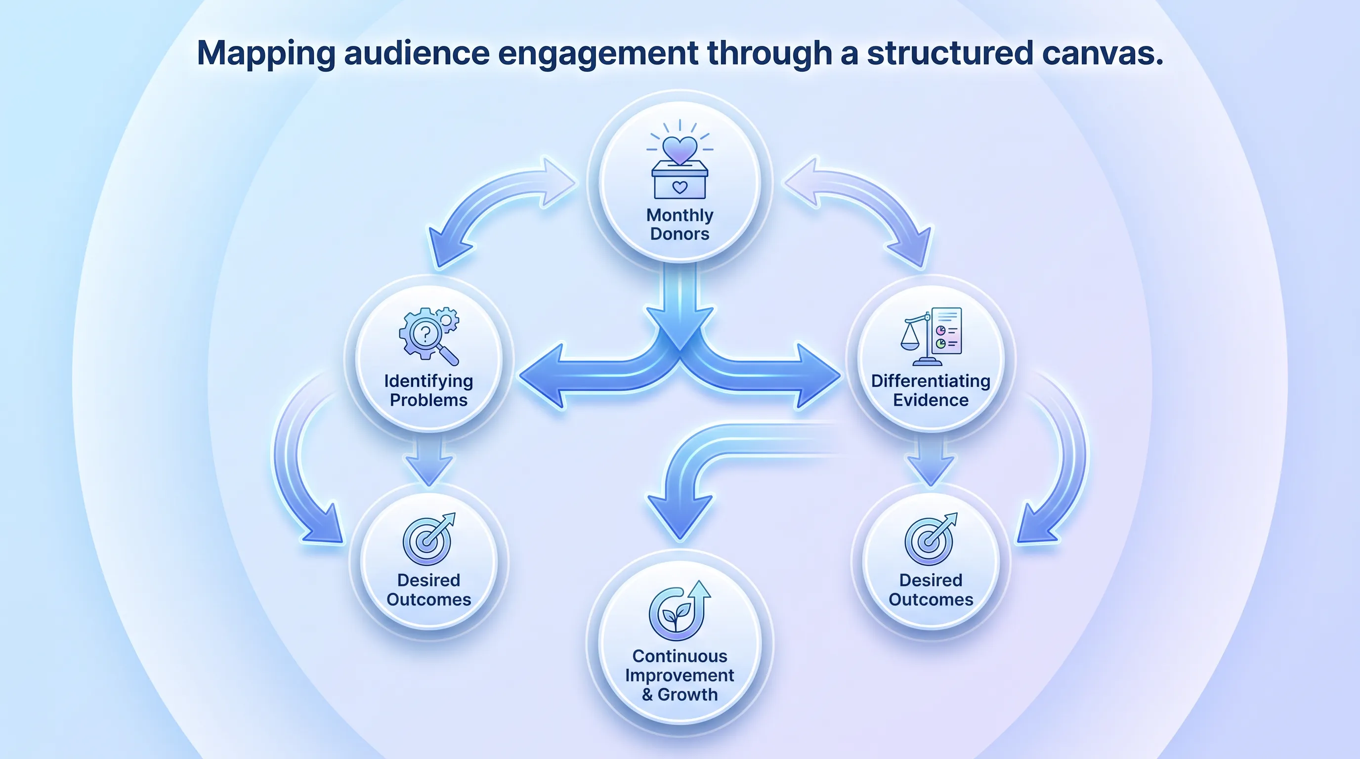
Symmetrical diagram illustrating audience engagement mapping with arrows connecting key elements, featuring soft blue gradients and readable text.

You don't need a brand agency to do this part. One page and three boxes, each filled with words a stranger would understand. A small team can complete it in ninety minutes, and the discipline of the format is what keeps the exercise from drifting into slogan-writing.

The canvas has a second use beyond drafting. When someone on your team argues for adding a line to the homepage, you check it against the canvas. If it doesn't answer one of the three questions for the audience you named, it doesn't go on the page.

Audience and problem

Name the specific stakeholder. "Monthly donors who gave under $50 and lapsed last year" is a person. "Supporters" is a mailing list.

Then write the problem as that person recognizes it. This is where internal terminology does the most damage, because the phrases that make sense in a grant report ("capacity gaps in the continuum of care") describe nothing a parent or a first-time donor would say out loud. If you can't find the problem in your interview notes, you haven't found the problem yet.

Need help with your AI visibility?

Book a free consultation with our experts we'll help you determine exactly which services your organization needs.

Outcome and role

Describe the change your audience wants in concrete terms, then show how their action produces it. Feeding America does this with a single line: every dollar helps provide at least 10 meals through its network of food banks. You know what you're buying.

The role part matters as much as the outcome. Donating and volunteering each connect to the result differently, so the canvas should say which lever this person pulls. A volunteer is spending an hour that Independent Sector valued at $34.79 in 2024, and they want to know that hour lands somewhere real.

Difference and evidence

Here's where most drafts of the nonprofit value proposition collapse into claims everyone makes. Compassionate. Community-driven. Results-oriented. Ask instead what's true about your approach that a credible alternative can't say, whether that's a geography you've worked in for twenty years or a relationship with a school district nobody else has.

Then attach proof to the claim. charity: water built its entire public identity on one verifiable structural fact, the "100% Model", where private donors cover operating costs so every public dollar funds water projects. That's a difference with evidence baked into it, which is why it survived scrutiny for years.

Draft the core message

Now compress. The canvas is raw material and the message is what fits above the fold, so expect to throw out two-thirds of what you wrote. Clarity beats cleverness every time here, because a clever line asks the reader to do interpretive work they will not do.

Andy Crestodina of Orbit Media Studios gives the practical rule: if you have a clever headline and a descriptive intro paragraph, flip them, since results are better when the headlines are clear and the copy is clever. That advice exists because people skim. Jakob Nielsen's analysis found users read at most 28% of the words on an average page visit, and 20% is the realistic figure.

Value proposition formulas

Formulas are a container that stops you from wandering. Fill one with canvas inputs and cut every word that doesn't survive a read-aloud:

  1. For [specific audience] who [recognized problem], we [what you do] so that [tangible outcome]. Unlike [credible alternative], we [distinct approach], proven by [evidence].

  2. [Action] and [outcome], because [proof point].

  3. We help [audience] [achieve outcome] in [place or population], with [track record].

The homepage version is shorter than any of these. Headline: what changes and for whom, in eight words or fewer. Supporting sentence: how it happens and one piece of evidence. Everything else moves down the page or onto another page entirely.

Nonprofit positioning statement

A nonprofit positioning statement is internal. It never goes on the website. Its job is to settle arguments inside your team about whom you serve and where you fit, so that fifteen people writing fifteen different things start writing the same thing.

April Dunford, who wrote Obviously Awesome, describes positioning as the "context we position our product in" such that its value becomes obvious to the right customers. Translated to your work, a nonprofit positioning statement names the population you serve and why your approach beats the alternatives that person is weighing. And those alternatives are real: another local organization or a government program.

Write it in one paragraph. Then test it against a hostile reader by asking whether a competing organization could sign their name to the same paragraph. If they could, you've described the sector rather than yourself, and the nonprofit positioning statement needs another pass.

Need help with your AI visibility?

Book a free consultation with our experts we'll help you determine exactly which services your organization needs.

Nonprofit messaging framework

Once the core proposition holds, it anchors a nonprofit messaging framework: three or four supporting points, each with its own proof, that you reuse across appeals and grant narratives. This is a one-page document. You're not writing a voice guide or a full architecture, and attempting one is how these projects die in a shared drive.

The structure is plain. Your nonprofit value proposition sits at the top. Below it, each supporting point answers an objection you heard in interviews, and each point carries evidence you can link to or cite. A nonprofit messaging framework built this way gets used, because a program officer writing a report can lift a proof point in thirty seconds.

What keeps the nonprofit messaging framework honest is the same discipline from the canvas. Every supporting point must connect back to the outcome your audience wants. Anything that only serves your internal narrative belongs in the annual report.

Review practical examples

Abstract advice fails at the moment of writing, so here's what the shift looks like across five audiences. Each rewrite makes the problem specific and the outcome measurable.

Donors. Before: "Support our mission to end hunger in our community." After: "$40 fills a family's grocery cart for a week at our Southside pantry. Last year we distributed 412,000 pounds of food with a staff of six. Give monthly." The problem moved from a national abstraction to a neighborhood, and the ask names a frequency.

Beneficiaries. Before: "We offer comprehensive wraparound services for at-risk youth." After: "If you're 16 to 24 and out of school, we'll help you finish your diploma and find paid work. No cost, no referral needed. Walk in Tuesdays and Thursdays." Notice that "at-risk youth" describes nobody to themselves. The rewrite drops the label and states eligibility, because the reader's real question is whether this is for them.

Volunteers. Before: "Join our team of dedicated volunteers making a difference." After: "Tutor one student for one hour a week, same student all semester. We train you in a single evening. Formal volunteering in the U.S. rebounded to 28.3% of Americans in 2023, and this is where an hour goes furthest." The commitment is now legible, which removes the fear of open-ended obligation.

Corporate partners. Before: "Partner with us to advance shared values of social responsibility." After: "We place 30 of your employees on a single-day build with impact reporting and a named site your team can visit. Four Fortune 1000 companies renewed with us in 2024." Partners buy a deliverable, so the after version sells one.

Institutional funders. Before: "Our innovative model addresses systemic barriers to health equity." After: "We run the only mobile dental clinic serving three rural counties, with 2,100 patient visits last year and a 71% return rate for follow-up care. We're requesting $180,000 over two years to add a second van." Funders read hundreds of these. Specificity is the only thing that separates you from the stack.

Test nonprofit value proposition

Your draft of the nonprofit value proposition is a hypothesis. Treat it that way, because the gap between what your team finds compelling and what a stranger understands is wide and predictable. Testing closes it cheaply.

Start with the five-second test, a method Katie Sherwin of Nielsen Norman Group describes as a way to gauge first impressions of a page. Show your homepage for five seconds and ask what the organization does and who it's for. If people can't answer, no amount of traffic will save the page. Then move to live comparison, since survey answers and behavior diverge constantly.

  • Run interviews with 10 to 15 people in your priority audience and use their exact words back to them

  • Split test two headline variants on your homepage and campaign pages, one per hypothesis

  • Track comprehension in the qualitative round and conversion in the quantitative one

The payoff is documented. NextAfter reported that testing a revised nonprofit value proposition on a main donation page produced a 116% increase in donations, and a separate experiment adding donor-name personalization to a headline lifted giving by 83%. Small organizations get smaller sample sizes and slower reads, which is fine. Run the test longer and watch clicks and gifts rather than opinions.

Put the message to work

Before you publish your nonprofit value proposition, run the check: one named audience and a single ask. Retest when programs shift or a campaign underperforms. Your nonprofit positioning statement should get revisited yearly, and the nonprofit messaging framework updated whenever a proof point expires.

Snoika Foundation helps NGOs and nonprofits get found and trusted in search and AI-driven discovery, which starts with messaging clear enough for both people and machines to quote. Book a messaging call to sharpen your nonprofit value proposition.
Need help with your AI visibility?

Book a free consultation with our experts we'll help you determine exactly which services your organization needs.

A nonprofit value proposition should stay stable long enough to measure audience response, usually for one campaign or page test. Change one major element at a time, such as the stated outcome or proof point, because simultaneous changes make the result hard to interpret.

You can use one core idea, but each audience needs its own message. A donor needs to understand what a gift funds, while a volunteer needs a clear time commitment. Keep the promised outcome consistent and change the proof and ask to match the reader.

Remove evidence that can't be checked or is outdated. Keep data tied directly to the result the reader cares about, with a date and source where possible. Internal activity counts belong elsewhere if they don't demonstrate a completed outcome.

Prioritize feedback from people whose decision the page seeks to influence. If donors and service users want different things, make separate pages or sections rather than averaging their views. Record the exact comment beside the decision it changed, so your team can revisit the rationale later.

Yes. Snoika Foundation can apply the same canvas to a new program after it identifies one audience, their recognized problem, and current evidence. The message should wait until staff can verify the outcome and delivery details, since unsupported claims weaken trust.

Book a Demo

Book a time that works best for you

You Might Also Like

Discover more insights and articles

Infographic with a glassmorphism style, featuring a 9-step process in three rows, with elegant blue-and-white icons and flowing connections.

How to Build AI-Ready Program Pages That Convert

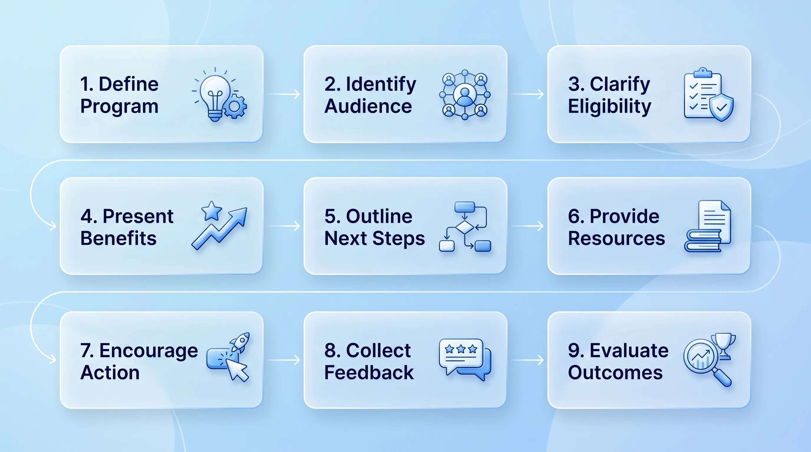
This article explains how to rebuild a programme page as an AI-ready program page structure so that a prospective participant and a language model can work out in seconds what you do and whether it applies to them. It walks through a nine-block architecture and a publishing workflow you can run with a small team.

Modern infographic with soft blue gradient background, featuring four circular glassmorphism cards connected by subtle lines and icons.

Nonprofit Call to Action Examples for Donations, Volunteers, and Advocacy

This article is a working swipe file of nonprofit call to action examples you can adapt for donations and volunteer recruitment. It covers copy formulas and a simple testing method so you can replace vague asks with ones that actually get completed.

Modern B2B technology infographic with frosted-glass cards, soft blue gradient, and elegant connections, centered on "Brand Guidelines.

Nonprofit Brand Identity: How to Build a Consistent System Beyond the Logo

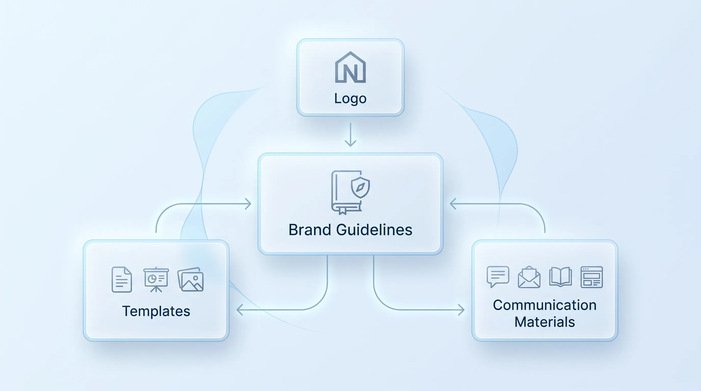
This article explains how to build a nonprofit brand identity that survives contact with reality: twelve staff members and no in-house design team. It covers the visual and verbal systems behind that consistency, plus the templates and governance that keep the whole thing alive after launch.

Flat design infographic comparing two donation website types: 'Visit-to-Donation Rate' on the left and 'Start-to-Completion Rate' on the right, with arrows i…

Donation Page Conversion Rate: Formula, Benchmarks, and Diagnostics

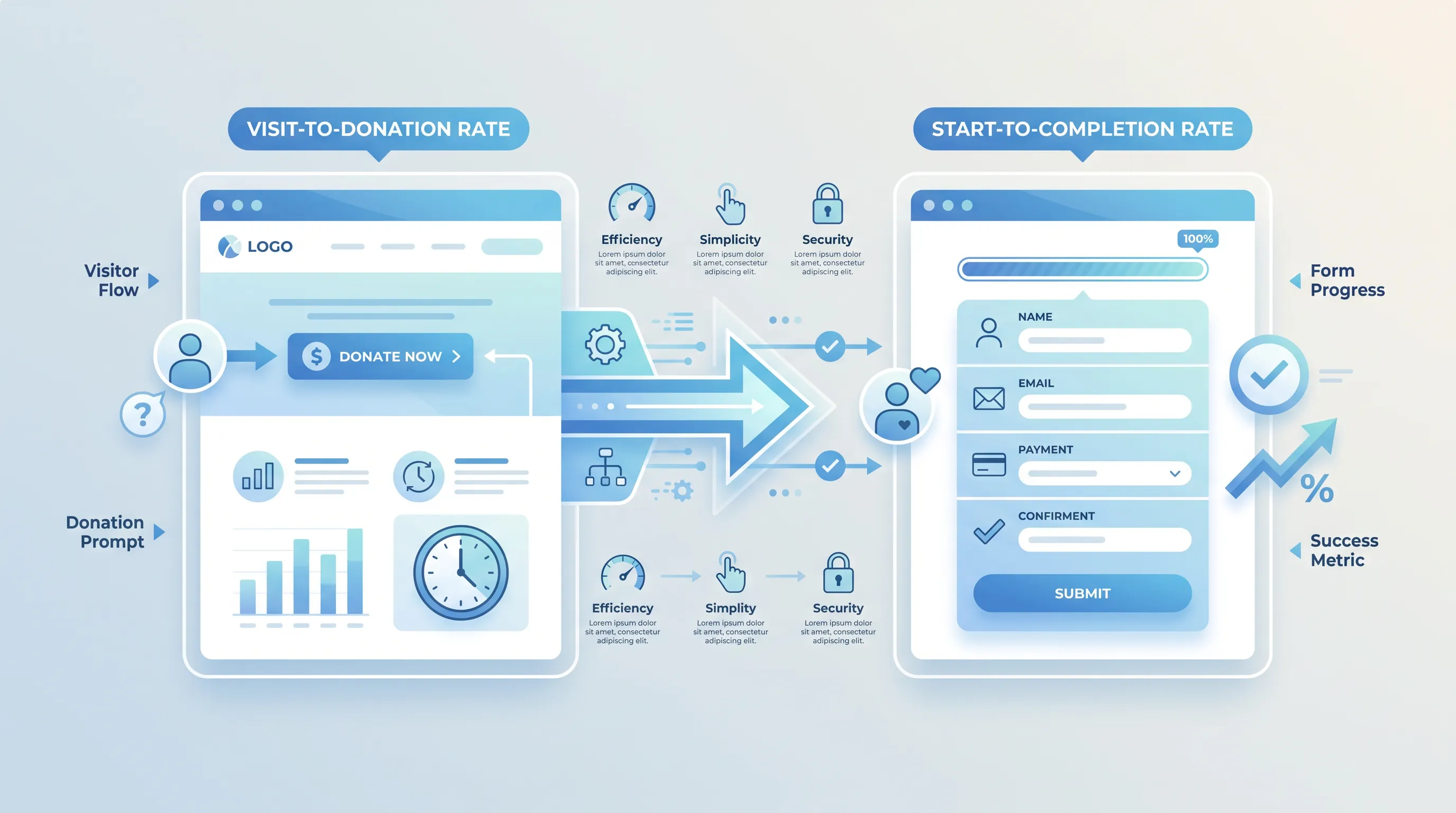
This article explains how to calculate and benchmark a donation page conversion rate without mixing up denominators. It walks through two formulas with worked numbers and a repeatable diagnostic sequence you can run before you change anything on the page.