Donation Page Conversion Rate: Formula, Benchmarks, and Diagnostics

Content authorArtem LozinskyPublished onReading time11 min read
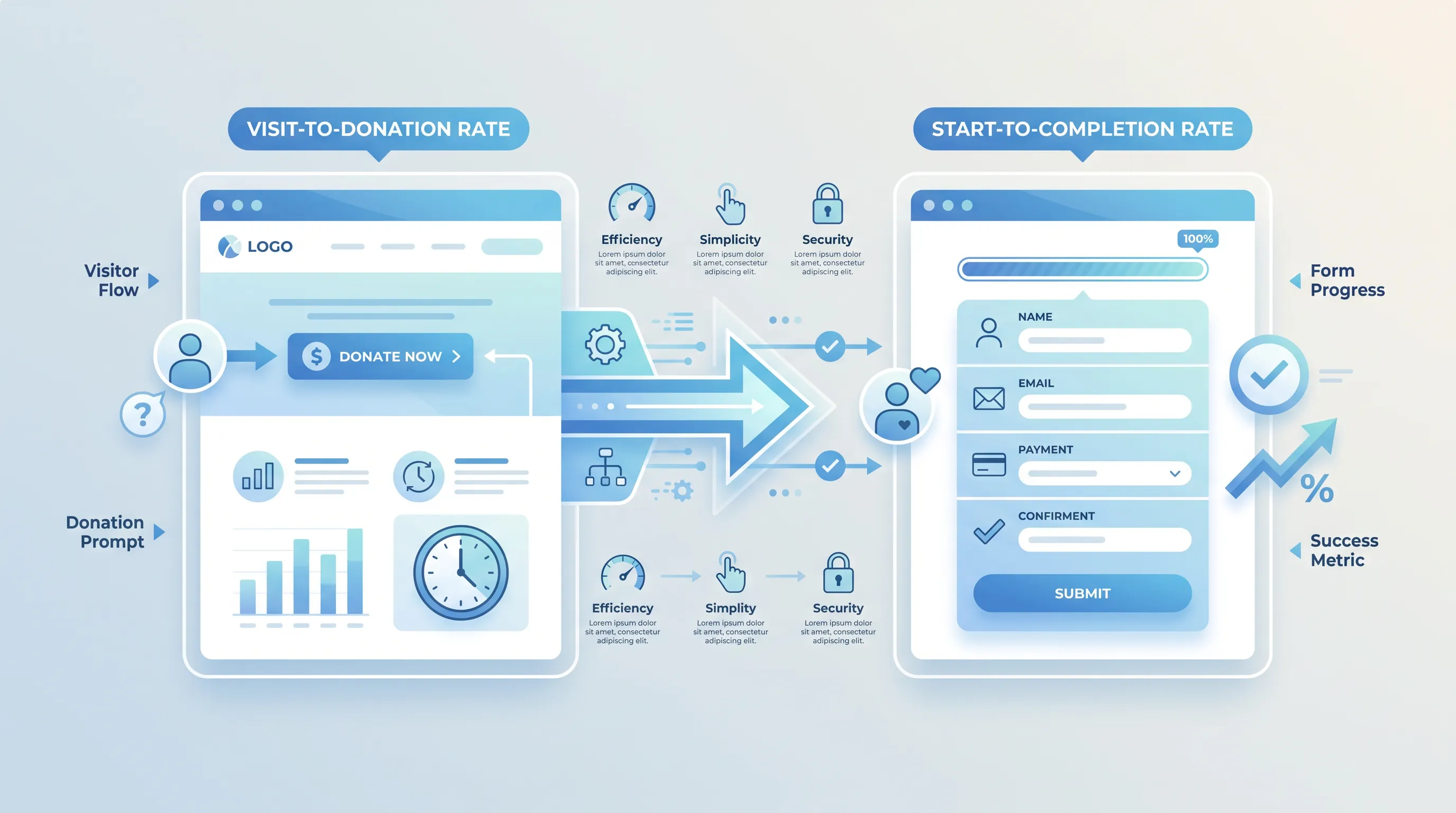
Flat design infographic comparing two donation website types: 'Visit-to-Donation Rate' on the left and 'Start-to-Completion Rate' on the right, with arrows i…

This article explains how to calculate and benchmark a donation page conversion rate without mixing up denominators. It walks through two formulas with worked numbers and a repeatable diagnostic sequence you can run before you change anything on the page.

Choose the right metric

Your donation page conversion rate looks straightforward until two people in the same meeting quote different numbers for the same month. One divided gifts by sessions. The other divided gifts by form starts, and both called the answer conversion. Before you compare your results against any donation conversion benchmarks, settle which question you're asking. Is the page failing to persuade people to begin, or is the form failing to let them finish? Those are separate problems with separate fixes, and a single blended number hides both. So the first decision is which denominator you're going to defend.

Visit-to-donation rate

Completed donations divided by unique donation-page visits, multiplied by 100. This donation page conversion rate measures whether the page as a whole earns the gift, which includes every element the visitor reads before touching a field. A donation page conversion rate built on this denominator answers one question: of everyone who arrived, how many gave?

Pick your denominator deliberately and then leave it alone. Users deduplicates the person who visits three times in December and gives once, which inflates your rate relative to a session denominator. Sessions counts each return trip separately and gives you a lower, more conservative number. Views is the loosest of the three because a single visitor reloading the page after a card error counts twice.

The denominator matters more than the choice itself. Switching from sessions to users mid-year produces a rise that looks like progress and isn't. Lock the definition into your reporting template and change it only when you're prepared to restate history.

Start-to-completion rate

Completed donations divided by form starts, multiplied by 100. A form start is the first meaningful interaction: a gift amount selection or the first keystroke in a field. This isolates everything that happens after intent is established, so a weak number here points at the form rather than the copy above it.

The gap between the two rates is where most of the argument gets resolved. Industry figures put donation form abandonment between 50 and 70 percent of people who begin, which means completion problems are rarely marginal. If your visit-to-donation rate is weak but start-to-completion is healthy, the page isn't convincing people to begin. If both are weak, you have two jobs, and you sequence them.

Set up funnel tracking

Neither formula is worth calculating until you can see the path a donor actually takes. That path crosses a website and a confirmation page, with a form and a payment processor in between. Each handoff is a place where measurement breaks quietly, and the number still renders in your dashboard as if nothing happened.

Map it before you instrument it. Write down every domain in the sequence, who controls the tag on each one, and what URL the donor sees at each step. Teams that skip this step end up doing donation funnel analysis on a funnel that doesn't match reality. Digital measurement should reflect the full journey.

Donation funnel analysis

Define the stages so that each one is a distinct, observable action. A workable set for most organizations looks like this:

  • Donation page view

  • Form start, triggered by the first field interaction or amount selection

  • Gift selection, which covers amount and one-time versus recurring

  • Payment attempt submitted to the processor

  • Successful donation confirmed by the processor

  • Payment failure, captured with a reason code

Stage-to-stage rates are the point. A funnel that loses 60% between view and form start is telling you something different from one that loses 60% between payment attempt and success, even when both produce the same donation page conversion rate at the bottom. Google's own reporting treats the checkout journey as a closed funnel, so a donor who skips a step drops out of the count entirely. Donation funnel analysis done on an unclosed funnel will read more forgiving than the truth.

Need help with your AI visibility?

Book a free consultation with our experts we'll help you determine exactly which services your organization needs.

Events and parameters

Use the standard ecommerce event names rather than inventing your own, because custom names don't populate the built-in reports. Google's specification requires currency, value, and items on begin_checkout. purchase needs a unique transaction_id. Send an event silently missing a required parameter and it's ignored without an error.

Attach parameters that let you slice the data later: campaign and the payment result with its decline reason. Then handle the four things that quietly corrupt donation funnel analysis:

  1. Cross-domain measurement. Configure your donation domain in the same web stream, and add the payment processor to the unwanted referrals list. Google warns that a redirect which strips query parameters will remove the _gl parameter and split one donor into two users.

  2. Duplicate events. A confirmation page that fires purchase on every reload will overstate gifts. Deduplicate on transaction_id.

  3. Consent. Behavioral modeling needs at least 1,000 daily events with analytics storage denied before it activates, and most nonprofit properties never reach that floor. Your observed numbers are a subset, and you say so out loud.

  4. Test transactions. Filter your own internal IPs and your $1 QA gifts, or your December rate will include the finance team.

Calculate donation page conversion rate

Match the date ranges exactly across numerator and denominator. A numerator pulled from your customer relationship management system for November 1 to 30 and a denominator pulled from analytics for a rolling 30 days will disagree by a few percentage points, and you'll spend a week chasing a discrepancy you created.

Take a real shape of numbers. In October a mid-sized organization records 24,800 unique users on its primary donation page and 1,984 completed one-time gifts. The visit-to-donation rate is 1,984 ÷ 24,800 × 100, which equals 8.0%. Over the same window, 6,200 of those users triggered a form start, so start-to-completion is 1,984 ÷ 6,200 × 100, or 32.0%. Two numbers, one month, and they point at different work.

The numerator rules decide whether your donation page conversion rate is honest:

  • Refunds and chargebacks. Subtract them if your board reads the rate next to net revenue. Twenty-six refunds in the example above pulls the rate from 8.0% to 7.9%.

  • Failed payments. These belong in a stage of their own, because recurring transactions are declined at roughly 15% of attempts according to Visa and Mastercard data.

  • Repeat visits. A users denominator already handles the donor who came back twice. A sessions denominator doesn't.

  • Recurring gifts. Count the initial transaction, not the twelve months of installments that follow, or January's rate will be flattered by December's sustainers.

  • Multiple forms. Calculate each form separately first. An aggregate across a general give page and an event registration form averages away the thing you're trying to find.

When the two rates disagree sharply, trust the donation funnel analysis over either headline number. The stages tell you where the loss sits. The headline only tells you that there is one.

Segment conversion performance

An aggregate donation page conversion rate is an average of audiences that behave nothing alike. M+R's participants recorded mobile users at 52% of all visits but only 28% of revenue, with an average desktop gift of $168 against $88 on mobile. Report one blended figure and you've folded two different problems into a number that describes neither.

Split by device first because the split is the largest and the cheapest to act on. Then acquisition source, since email traffic arrives with far more intent than a cold display click and will convert several times higher without your page doing anything differently. Campaign and geography come next, and one-time versus recurring after that.

Two rules keep segmentation from producing nonsense. Require enough volume before you draw a conclusion, because a 40% rate from 15 sessions is noise wearing a number. And always pair the rate with revenue per visitor, since a segment can convert beautifully at $12 a gift and still be worth less than one converting half as well at $150. M+R reported $1.33 per visitor across all website traffic in 2025, which is a useful second axis when donation conversion benchmarks alone push you toward the wrong winner.

Need help with your AI visibility?

Book a free consultation with our experts we'll help you determine exactly which services your organization needs.

Use donation conversion benchmarks

Published figures are context, not a target. The 2026 M+R study, based on data from 180 nonprofits, found 11% of desktop visitors and 8% of mobile visitors who reached a primary donation page completed a gift. Small organizations fared worse on phones, as they converted mobile at just 4%. Across an entire website, 1.6% of visitors gave, with sector results ranging from 0.6% to 3.3%.

Six things limit what those donation conversion benchmarks can tell you about your own page. Traffic intent differs, because a house email file behaves nothing like paid social. Campaign type differs, since an emergency appeal outperforms an evergreen give page. Platform differs, and so does the metric definition, which is the whole reason the denominator argument matters. Seasonality distorts everything: M+R participants raised 37% of annual online revenue in December 2025, so a November number and a July number aren't comparable. And the sample is self-selected, weighted toward organizations invested enough in digital measurement to submit data.

Use the published figures as a directional check. If you're sitting at 3% on desktop against a sector figure of 11%, that gap is worth investigating. If you're at 9.5%, stop benchmarking and start running donation funnel analysis on your own data, because the answer isn't in someone else's report.

Diagnose donation page conversion rate

Run the same sequence every time. Diagnosis that changes shape each quarter produces conclusions you can't compare.

Start by validating the data. Confirm gift counts in analytics against the processor's settlement report for the same dates. If they're more than a few percent apart, fix that before you interpret anything, because you're about to make decisions on a number that doesn't reconcile. Check that test gifts are excluded and that no stage is double-counting.

Then find the largest stage loss and segment it. A page that loses most of its traffic before form start has an acquisition or a persuasion problem, and the form is innocent. A page that loses people between payment attempt and success has a processing problem, which is where decline reason codes earn their keep. GoCardless found that a single automated retry recovers an average of 32% of failed payments, so some of that loss is recoverable without touching the design.

Compare the trend against the same period last year, since November alone carries 11.2% of annual nonprofit website traffic and any month-over-month comparison across year-end is meaningless. Inspect technical errors next: console errors on the form and mobile rendering on real devices. Finish by pricing the loss. Recovering 200 gifts a year at your current average is either a rounding error or a hire, and that arithmetic decides what happens next.

Turn findings into action

Rank what you found against how much traffic the issue touches and what it costs to build. A confirmed payment error affecting every mobile donor outranks a copy hunch affecting 4% of desktop traffic, even though the copy change is the easier afternoon's work.

Published experiments are useful for sizing the upside before you commit. NextAfter documented a 44.8% lift in donations from a donation page redesign that stripped navigation and clarified the value proposition, against a control already converting at 30.9%. A separate test found a 56% increase in conversions when the copy moved from organization-centric to communal language. Tactical fixes belong in our optimization guide, because the point of this article is that you reach for them once your donation page conversion rate tells you which fix to reach for.

Then test what you changed, in a controlled A/B split with a sample size calculated before launch. Report the result the same way every month, with the denominator stated and your own donation conversion benchmarks from prior periods alongside it. Donation funnel analysis is a habit, not a project, and the organizations that treat it that way stop guessing within a quarter or two.

Get an expert review

Snoika Foundation works with nonprofits and NGOs on digital measurement, and tracking audits are part of that work. If your gift counts don't reconcile with your processor, or your funnel drops donors at a stage nobody can explain, we'll map the journey across your site and payment domains and show you where the data breaks. Book a call with our team, and bring the report you don't trust. That's the fastest route to a donation page conversion rate you can defend.
Need help with your AI visibility?

Book a free consultation with our experts we'll help you determine exactly which services your organization needs.

Pause performance decisions and reconcile the records before changing the page. Check the date range, time zone, transaction status, refunds, and duplicate transaction IDs. Compare a small set of individual gifts across both systems, then document the confirmed source of truth. A donation page conversion rate is useful only when its inputs match.

There’s no universal traffic threshold, so set a minimum before reviewing results and keep it consistent. Small groups can produce unstable rates when one gift changes the result sharply. Compare a segment’s rate with its gift count, revenue per visitor, and the same period from an earlier campaign before acting.

You can compare campaigns only after confirming that they use the same denominator, date rules, and conversion definition. Record whether each campaign brought email, search, display, or social visitors because intent changes the result. If those conditions differ, compare each campaign with its own past performance instead.

A higher rate can produce less revenue when the converted gifts are smaller. For example, a segment converting at 6% with $20 average gifts can earn less per visitor than one converting at 3% with $150 average gifts. Review revenue per visitor and average gift beside the conversion rate.

Ask Snoika Foundation for a tracking review when processor settlements and analytics remain unreconciled after you check dates, refunds, test gifts, and duplicate events. A review also helps when a payment or cross-domain stage loses donors without a clear reason. Bring event definitions, stage counts, and processor reports for the same period.

Book a Demo

Book a time that works best for you

You Might Also Like

Discover more insights and articles

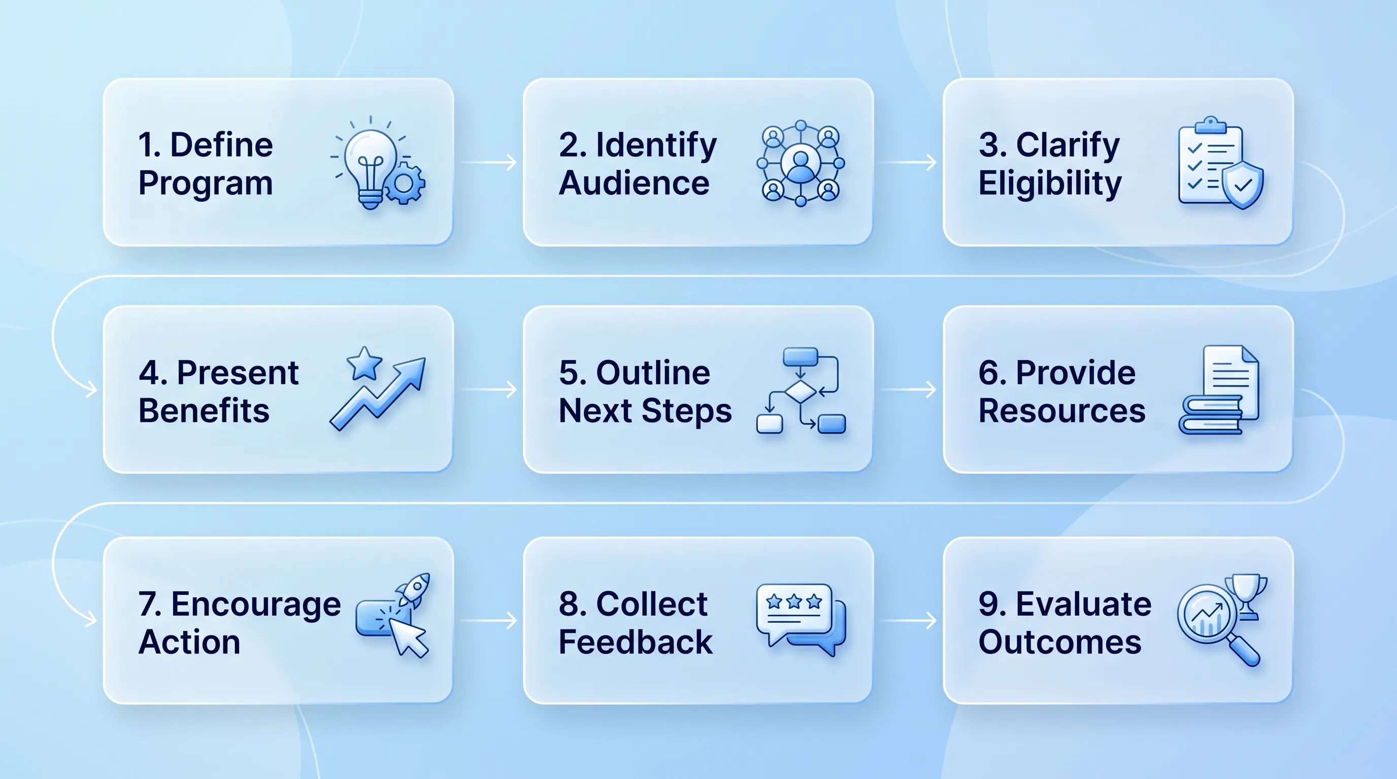
Infographic with a glassmorphism style, featuring a 9-step process in three rows, with elegant blue-and-white icons and flowing connections.

How to Build AI-Ready Program Pages That Convert

This article explains how to rebuild a programme page as an AI-ready program page structure so that a prospective participant and a language model can work out in seconds what you do and whether it applies to them. It walks through a nine-block architecture and a publishing workflow you can run with a small team.

Modern infographic with soft blue gradient background, featuring four circular glassmorphism cards connected by subtle lines and icons.

Nonprofit Call to Action Examples for Donations, Volunteers, and Advocacy

This article is a working swipe file of nonprofit call to action examples you can adapt for donations and volunteer recruitment. It covers copy formulas and a simple testing method so you can replace vague asks with ones that actually get completed.

Modern B2B technology infographic with frosted-glass cards, soft blue gradient, and elegant connections, centered on "Brand Guidelines.

Nonprofit Brand Identity: How to Build a Consistent System Beyond the Logo

This article explains how to build a nonprofit brand identity that survives contact with reality: twelve staff members and no in-house design team. It covers the visual and verbal systems behind that consistency, plus the templates and governance that keep the whole thing alive after launch.

A minimalistic vector diagram showing interconnected digital processes with a cool blue gradient background and no title.

Nonprofit Color Palette: How to Choose Accessible Brand Colors

This article explains how a small communications team can pick and test brand colors without a designer on staff. It covers strategic criteria and the documentation that keeps charity brand colors consistent once volunteers and vendors start using them.