Primary brand colors
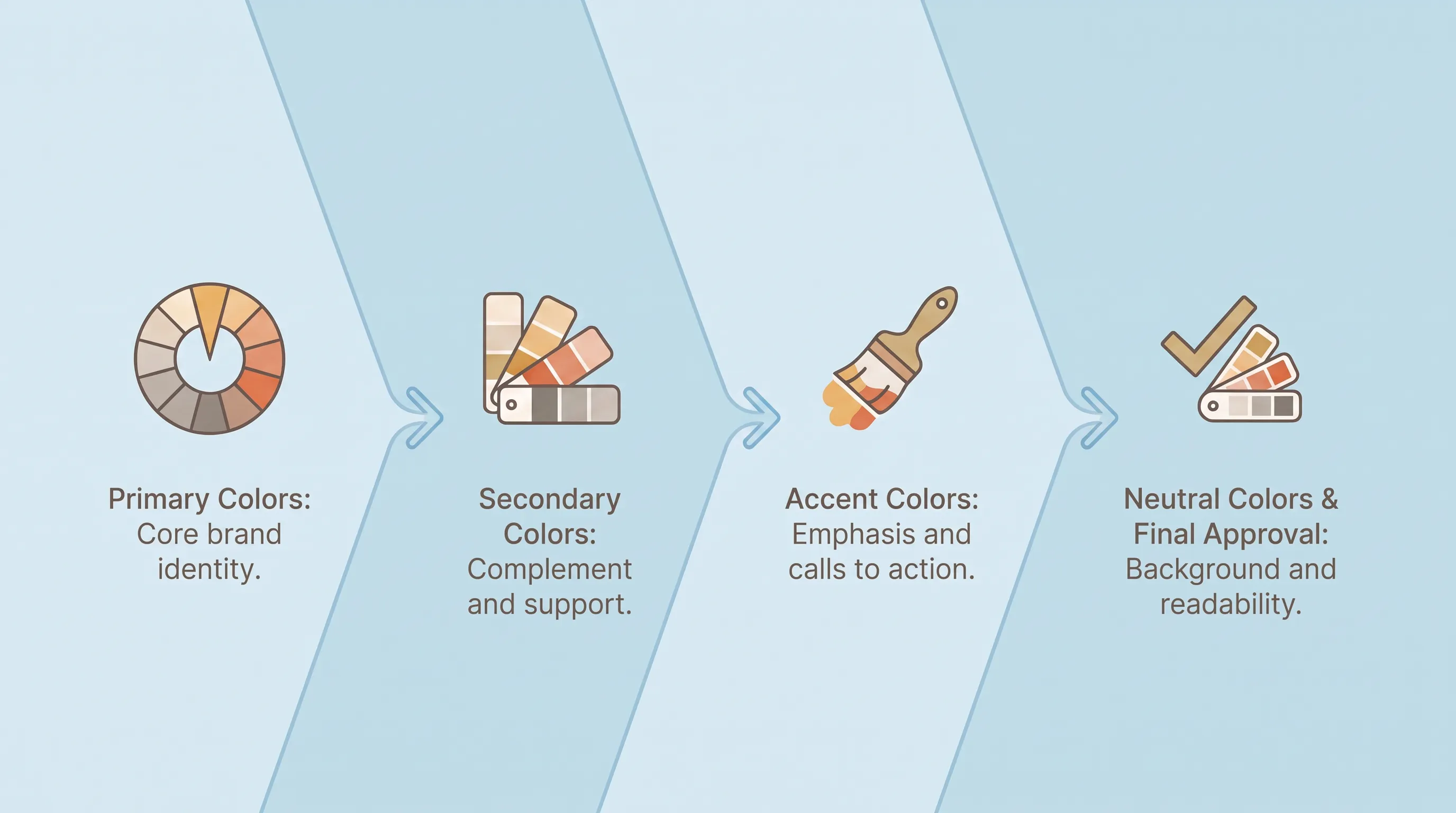
Your primary is the color someone would name if you asked them to describe your organization from memory. Pick one that carries the logo, the header, and the campaign lockup without help. Two primaries work when they're genuinely paired, the way charity: water runs yellow against blue, with the yellow jerry can as the anchor and water as the second note.
Distinctiveness beats prettiness here. A muted sage that three peers already use will blur into the sector. Choose the color you can defend in a sentence, then check it survives on a photograph and a one-color tote bag, because charity brand colors live on merchandise whether you planned for it or not.
Secondary support colors
Two secondaries is the ceiling. They exist to give a campaign page or a report cover somewhere to go without introducing a new identity, and they sit clearly below the primary in visual weight. If a secondary competes with the primary for attention, it isn't a secondary.
More colors feel generous and behave badly. Every extra swatch multiplies the pairings someone has to evaluate, and the person laying out the newsletter at 4pm on Thursday isn't going to evaluate anything. Fewer choices produce more consistent charity brand colors across a year of output.
Accent action colors
Reserve one high-contrast accent for donation buttons and links. The discipline is in the reservation: if the accent also appears in decorative headers and section dividers, it stops signaling anything. Use it where you want a click and nowhere else.
Don't assume a particular accent hue converts better. Fundraise Up tested matching checkout accent colors to nonprofit branding and recorded no significant increase in conversions, while adding a social proof notification lifted conversion 3.5%. Contrast against the surrounding page is what does the work in a nonprofit color palette.
Neutral foundation colors
Arbitrary grays are how palettes rot. Define a near-black for body text and one or two mid-grays for secondary text and borders, with an off-white and a light tint for backgrounds. Wikimedia's core palette does this with three named steps between black and white, which means nobody invents a fourth.
Name each neutral by job rather than by shade, so "border" and "body text" appear in the file instead of "gray 3." Your mid-gray needs the same contrast check as everything else, because light gray on white is the single most common failure in an otherwise careful nonprofit color palette.
Test your nonprofit color palette
Testing is a checklist you run before anyone signs off, and it takes an afternoon. Build a grid of every pairing that will realistically appear: text on each background and accent on each background.
The rule that catches teams out is scope. Check the combinations that show up in the donation form and the volunteer sign-up sheet, because those are where the failures hide.
Accessible brand color palette
Three numbers cover most of what you need. Body text needs a contrast ratio of at least 4.5:1 against its background under WCAG 2.1 Level AA, and large text (18pt, or 14pt bold) needs 3:1. Interface elements like button borders and meaningful icons need 3:1 for graphics under criterion 1.4.11.
For US organizations, this stopped being optional in parts of the sector. The Department of Justice's 2024 Title II rule set WCAG 2.1 Level AA as the technical standard for state and local government digital content, and an interim final rule pushed large-entity compliance to April 26, 2027. If you're contracted by a public entity, that standard reaches you.
Two free tools handle the checking. The WebAIM Contrast Checker runs in a browser, and TPGi's Colour Contrast Analyser is a desktop app with an eyedropper, so you can sample colors from a PDF or a slide deck. Run every pairing through one of them and record the result next to the color, which is what turns a set of swatches into an accessible brand color palette.