Nonprofit Brand Identity: How to Build a Consistent System Beyond the Logo

Content authorArtem LozinskyPublished onReading time11 min read
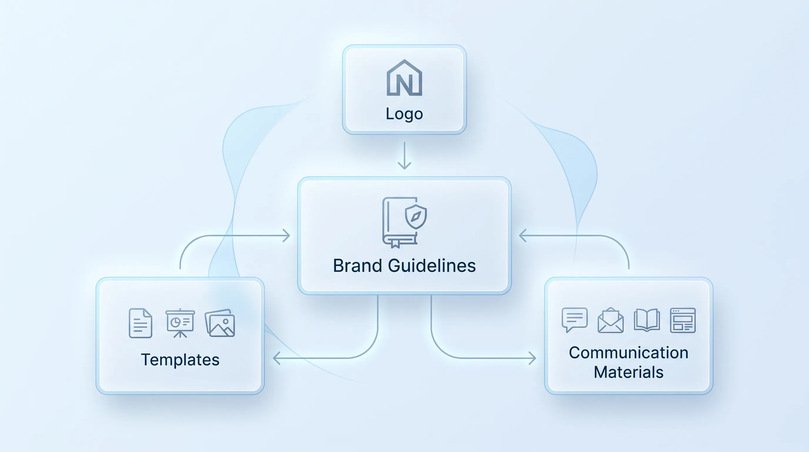
Modern B2B technology infographic with frosted-glass cards, soft blue gradient, and elegant connections, centered on "Brand Guidelines.

This article explains how to build a nonprofit brand identity that survives contact with reality: twelve staff members and no in-house design team. It covers the visual and verbal systems behind that consistency, plus the templates and governance that keep the whole thing alive after launch.

What nonprofit brand identity includes

Your nonprofit brand identity is the part people actually meet. Logo files and the photograph you picked for last year's report. Brand strategy sits underneath and answers who you are and who you serve. Guidelines are the document that records those decisions, and a logo is one asset inside the system rather than the system itself.

Nathalie Kylander and Christopher Stone, who researched nonprofit branding at Harvard's Hauser Center, described the external brand as "the image held in the minds" of every stakeholder an organization touches. That image gets assembled from whatever people encounter. Which means the fix is a system that makes the next flyer look like it came from the same place as the last one.

Build the visual system

Most inconsistency is a supply failure. Lidia Varesco Racoma, a Chicago nonprofit brand strategist, told Business.com that "limited budgets, small teams" and time pressure mean materials get created on the fly, which produces an inconsistent brand experience. A volunteer building an event flyer at 9pm will use whatever logo file turns up first in the shared drive.

So the nonprofit visual identity has to be built as a kit. Every element needs a file and a place someone can find it in under a minute. The test is whether a board member designing a Facebook post ends up on-brand by accident.

Create a flexible logo system

One logo file guarantees misuse, because no single lockup fits a square avatar and a banner. charity: water's brand book solves this by supplying horizontal configurations plus a standalone jerry can icon that's approved for use on its own. Give people the version they need and they stop inventing one.

A working logo set for a small team holds:

  • A primary lockup and a horizontal version for headers and email signatures

  • A stacked version for square and narrow spaces

  • One-color black and one-color white files for photocopies, embroidery, and dark backgrounds

  • An icon or monogram for social avatars and favicons

Spacing and size rules matter, and they're easy to write down. Feeding America tells partners the logo should never print below 1 inch or 73 pixels wide and reserves the full-color version for light backgrounds. Local food banks in the network follow a further rule: in a partner lockup, the Feeding America mark sits at 25% of the size of the food bank's own logo. That's the kind of instruction a volunteer can follow without judgment calls, and it keeps your nonprofit visual identity intact in co-branded work you don't control.

Define nonprofit visual identity

Color comes first because it carries recognition and fails often. Pick your palette against contrast requirements, since WCAG Success Criterion 1.4.3 requires text to hit a contrast ratio of 4.5:1 against its background, or 3:1 for large text. Mid-tone brand colors are where teams get burned, because a warm orange that sings on a poster becomes unreadable body text on white.

Typography needs a hierarchy. Decide the heading face and the body face, then write down the sizes. East Texas Food Bank names Gotham as its primary typeface and Arial as the substitute when Gotham isn't available, which removes the moment where someone picks a random Google font.

Photography carries the mission more directly than color does, so define it by the decision it represents. What does a person look like in your photographs? Are they mid-action or posed, named or anonymous? A nonprofit visual identity that specifies "eye-level, natural light" gives a volunteer photographer something to aim at. Vague words like "authentic" give them nothing.

Need help with your AI visibility?

Book a free consultation with our experts we'll help you determine exactly which services your organization needs.

Build the verbal system

Language drifts faster than design because everyone writes and almost nobody thinks they're doing brand work. A grant officer and a program manager will describe the same program three different ways inside a single week. The verbal half of a nonprofit brand identity exists to shrink that gap without making people sound like robots.

The goal is repeatable language, which is different from fixed language. You're giving people sentences they can adapt, plus the reasoning behind why those sentences work.

Shape mission-driven brand identity

Start with what your audiences already need to hear, then trace it back to mission and values. Farra Trompeter, co-director at the nonprofit communications cooperative Big Duck, put the diagnostic simply when describing how she tests a brand: if she hears about "10 different organizations" doing 10 different things when she asks staff to describe the place, that's the problem to solve before anything external gets written.

A mission-driven brand identity turns that internal agreement into short statements people can reuse. What you do and what changes because of it. Keep the personality attributes to words that actually rule things out. "Warm" is only useful if it means you don't write like a policy brief.

This is the minimum internal agreement that lets a mission-driven brand identity show up the same way in a tweet and a funder report.

Set voice and tone

Voice stays constant and tone moves. Your voice is the personality that shows up whether you're announcing a win or a funding cut. Tone is the adjustment you make for the moment, and the useful version of this in guidelines is a short table: the channel and one sentence on what shifts.

Fundraising asks for something, so it gets warmer and more direct about what a gift does. Advocacy runs on urgency and specific asks, which the M+R Benchmarks data supports, since advocacy emails pulled a 2.3% click-through rate against 0.59% for fundraising messages in 2025. Service communication drops the persuasion entirely and prioritizes clarity for someone trying to get help. Crisis communication gets short sentences and a named person to contact. A mission-driven brand identity holds across all four, because the underlying values don't change when the situation does.

Create messaging and stories

Core messages and a tagline do most of the daily work. Write two or three versions of each core message at different lengths so nobody has to improvise a cut-down. The value proposition should answer the donor's real question, which is what their money changes, not what your programs are named.

Impact storytelling needs ethical guardrails written into the system. The Dóchas Code of Conduct on Images and Messages, adopted by Irish development organizations, sets out seven guiding principles that require truthful representation of context and full consent from the people pictured. Feeding America goes further on word choice, instructing partners to avoid casting donors as heroes who "save" anyone and to write "neighbors experiencing food insecurity" instead of "the hungry."

Then give people a reusable structure. A person with a name and a specific situation, and one sentence on what the reader can do next. Anyone on staff can fill that in, and a mission-driven brand identity stays intact even when the writer isn't a writer.

Need help with your AI visibility?

Book a free consultation with our experts we'll help you determine exactly which services your organization needs.

Design for accessibility

Accessibility built into the palette and templates costs almost nothing. The scale of the problem is visible in WebAIM's annual scan of the top million home pages, which found low-contrast text on 83.9% of them in 2026. The average was 34 separate instances per page.

Alt text is where small teams lose the most ground, because it gets written fast or not at all. The W3C's alt decision tree resolves the question in about thirty seconds: decorative images take an empty alt attribute, and informative images carry the meaning the image adds. Captions aren't optional either, since WCAG lists captions for prerecorded audio in synchronized media as a Level A requirement, the baseline tier.

Reading level belongs in the same bucket. The State of California's content design standard recommends writing at an 8th grade reading level or lower, partly because translation into other languages is more accurate at that level. Write your plain-language rule and your alt text rule directly into the templates, and a nonprofit visual identity stops producing material that half your audience can't use. That's the difference between a nonprofit brand identity that includes people and one that only claims to.

Turn rules into tools

A guidelines PDF is necessary and insufficient. Lucidpress found that even among organizations that recognized consistency as important, 81% of companies still dealt with off-brand content. The template is the intervention.

Build the asset library first, because people go looking for files, not rules. One folder, clearly named, with logo variations, approved photography, and the brand guide sitting inside it. Canva's nonprofit program gives registered organizations free Pro access with a Brand Kit for up to 50 users per team, which covers a staff-plus-volunteer group at most small organizations without a licensing conversation.

Then template the formats your team produces every week:

  • Social posts in the three sizes you actually use, with text areas already contrast-checked

  • A presentation deck with title, section, and data slides locked to brand type

  • An email header and footer, plus a standard donation ask block

  • Report and event collateral covers, with space reserved for partner logos

Lock the elements that carry recognition and leave the rest open. A template that forbids everything gets abandoned, and the version people build from scratch is always worse. This is the practical core of turning a nonprofit brand identity into something a busy team can run without asking permission.

Roll out across channels

Phase it by traffic, not by enthusiasm. Your website carries more supporter contact than anything else you own, as do your email template and your donation page, which is why M+R recorded 37% of all 2025 online revenue arriving in December alone. Fixing those three before year-end beats fixing everything at once and finishing none of it.

Replace outdated assets deliberately. Print stock gets used up before reorder, and anything a partner controls goes on a written request with the new files attached. Keep a short list of where the old logo still lives, because it lives on a sponsor's website from 2019.

Training matters more than the launch email. Twenty minutes with staff and volunteers does more than a fifty-page document ever will, because you show where the files sit and how to use two templates. Content adapts to each channel while the nonprofit brand identity underneath stays fixed, and people only learn that distinction by doing it once with someone watching.

Govern nonprofit brand identity

Someone owns this or nobody does. Name the person who approves external materials and write down which decisions don't need approval at all so the process doesn't become a bottleneck. Only 17% of nonprofit communications teams grew in 2025, according to the 16th annual Trends Report from Nonprofit Marketing Guide, so governance has to be designed for the team you have.

File management is governance too. One source of truth, dated versions, and a rule that nobody emails logo files as attachments. New staff and volunteers get the asset library link during onboarding, not on their first deadline. Exceptions get granted in writing with an end date, because a temporary campaign lockup left unattended becomes a second brand.

Audit twice a year against a fixed list:

  1. Pull ten recent pieces from different people and check logo use, color values, and type against the guide

  2. Run contrast and alt text checks on the pages and posts you published most recently

  3. Read your core messages aloud and mark anything describing a program you no longer run

  4. Note which templates people avoided, then find out what was wrong with them

The fourth item is the one that keeps a nonprofit brand identity honest. Templates people route around are broken templates, and the drift they cause is a design problem, not a discipline problem.

Get expert support

Internal fixes work when the strategy is settled and the gap is execution: missing files and no templates. Bring in outside help when staff describe the organization differently from each other, or when the identity predates the work you do now. Snoika Foundation works with nonprofits and NGOs on brand systems and content, with a Brand Builder that generates a usable kit of logo and palette. Book a call with our team and we'll tell you honestly which half of your nonprofit brand identity needs the work.
Need help with your AI visibility?

Book a free consultation with our experts we'll help you determine exactly which services your organization needs.

Measure whether people recognize the organization, find approved assets quickly, and complete routine publishing tasks without help. Track production time, template use, accessibility errors, and repeated requests for missing files. These measures show whether the system works under normal workload.

Review the guidelines at least twice a year and after major changes to programs, leadership, partnerships, or accessibility requirements. Ask staff which rules caused confusion, then revise the examples and templates. Date every update so people can identify the current version.

Yes, if the templates are available in tools volunteers already use and include clear export instructions. Provide editable versions for approved platforms, plus ready-to-use PDF and image files for people who only need to publish. Limit editing rights for core logos and colors.

Use informed consent that explains where the story and images will appear, how long they may remain public, and whether names can be changed. Remove unnecessary identifying details, especially in health, housing, or legal situations. Let the person review factual details before publication.

Hire outside support when staff describe the organization in conflicting ways, the current identity no longer matches the work, or internal capacity cannot resolve repeated production problems. Snoika Foundation is named in the article as one provider of nonprofit brand systems and content support.

Book a Demo

Book a time that works best for you

You Might Also Like

Discover more insights and articles

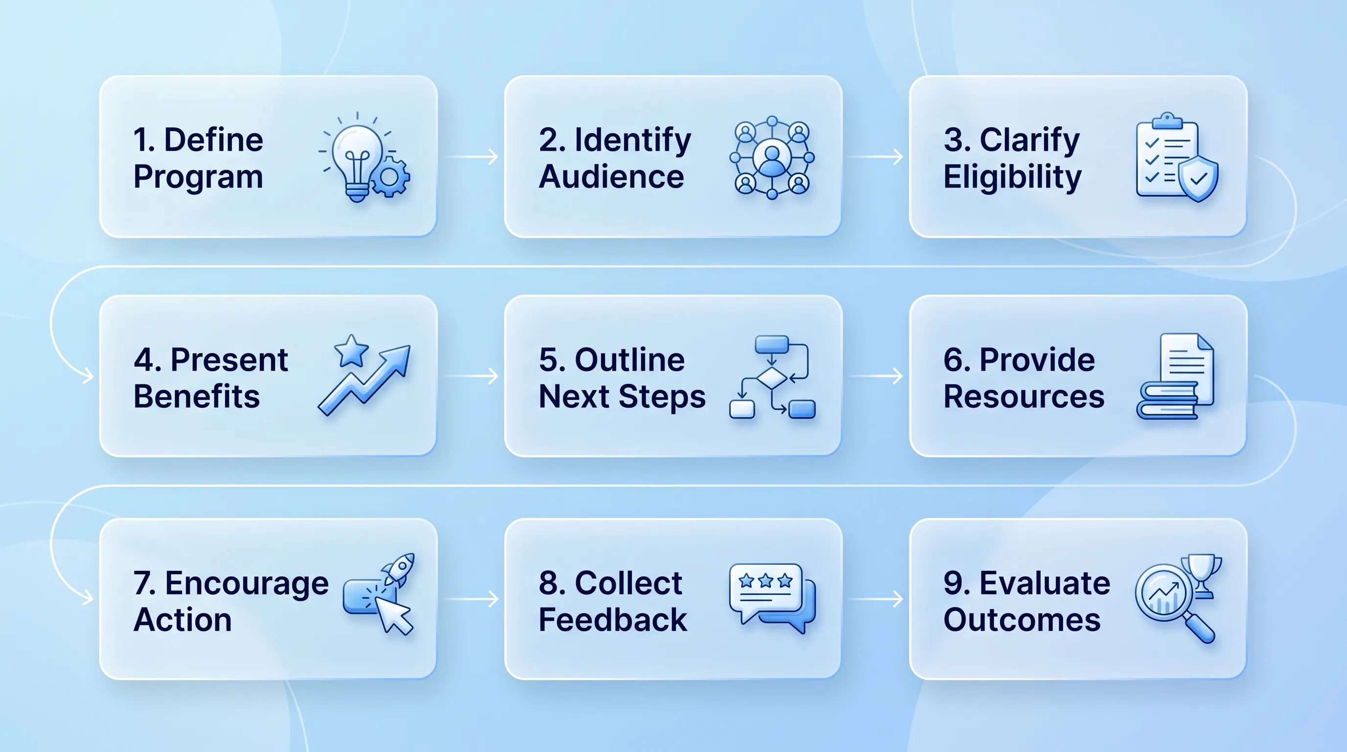
Infographic with a glassmorphism style, featuring a 9-step process in three rows, with elegant blue-and-white icons and flowing connections.

How to Build AI-Ready Program Pages That Convert

This article explains how to rebuild a programme page as an AI-ready program page structure so that a prospective participant and a language model can work out in seconds what you do and whether it applies to them. It walks through a nine-block architecture and a publishing workflow you can run with a small team.

Modern infographic with soft blue gradient background, featuring four circular glassmorphism cards connected by subtle lines and icons.

Nonprofit Call to Action Examples for Donations, Volunteers, and Advocacy

This article is a working swipe file of nonprofit call to action examples you can adapt for donations and volunteer recruitment. It covers copy formulas and a simple testing method so you can replace vague asks with ones that actually get completed.

Flat design infographic comparing two donation website types: 'Visit-to-Donation Rate' on the left and 'Start-to-Completion Rate' on the right, with arrows i…

Donation Page Conversion Rate: Formula, Benchmarks, and Diagnostics

This article explains how to calculate and benchmark a donation page conversion rate without mixing up denominators. It walks through two formulas with worked numbers and a repeatable diagnostic sequence you can run before you change anything on the page.

A minimalistic vector diagram showing interconnected digital processes with a cool blue gradient background and no title.

Nonprofit Color Palette: How to Choose Accessible Brand Colors

This article explains how a small communications team can pick and test brand colors without a designer on staff. It covers strategic criteria and the documentation that keeps charity brand colors consistent once volunteers and vendors start using them.