Nonprofit Logo Design: How to Create a Trustworthy Mission-Driven Logo

Content authorArtem LozinskyPublished onReading time14 min read
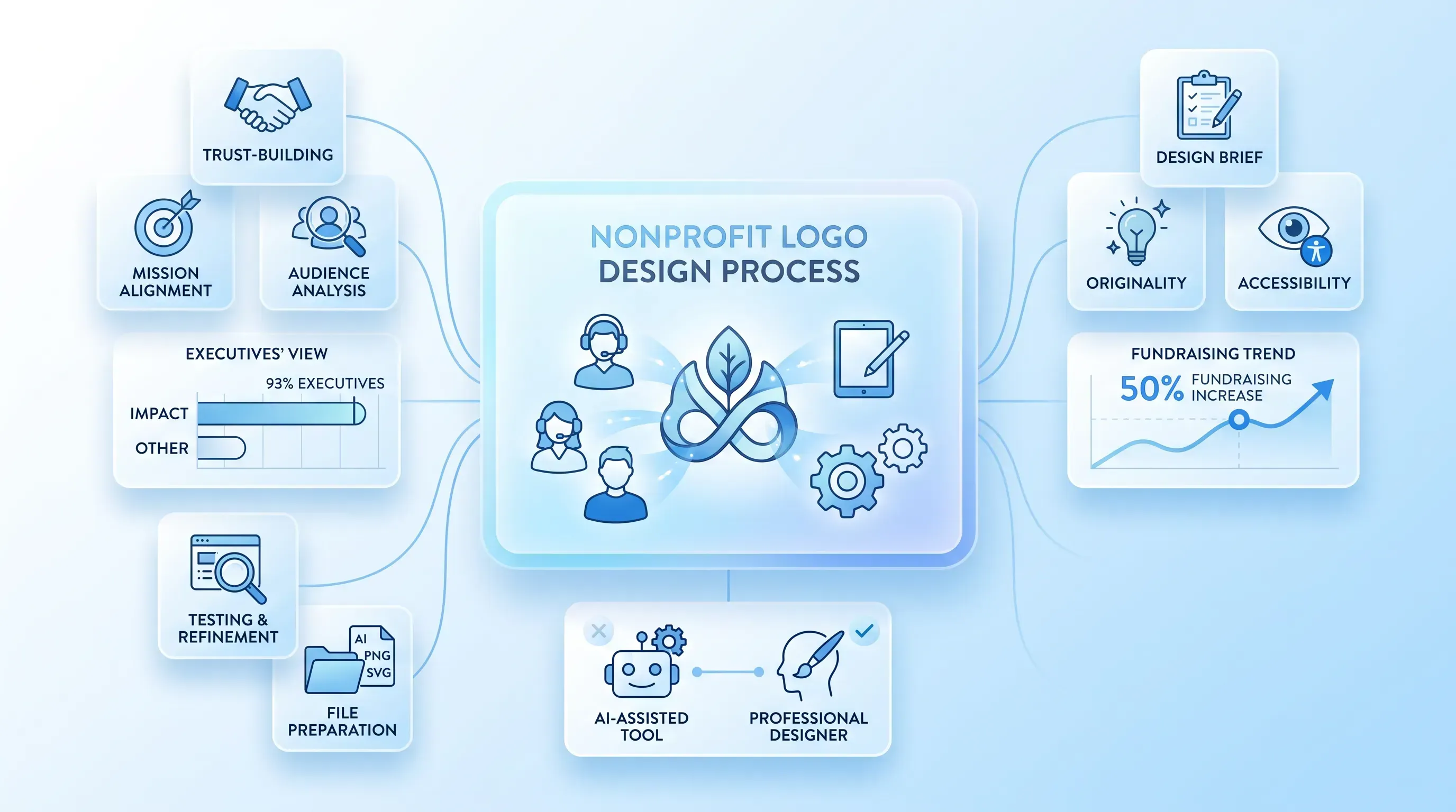
A layered SaaS infographic featuring a central translucent card showing the nonprofit logo design process, surrounded by mini-cards for key phases.

This article walks a small or newly formed nonprofit through nonprofit logo design without an in-house designer. It explains how to build the brief and choose a design direction, then takes the team through the remaining design process.

Why the logo has to earn trust before it looks good

A good nonprofit logo design starts with a decision most teams skip: what the mark actually needs to accomplish. The focus is on what it should do. Because nonprofit logo design carries a heavier load than one for a coffee shop. Someone deciding whether to give you money or time has less to go on than a paying customer does.

That instinct has evidence behind it. A survey of 500 nonprofit executives found 93% believe a strong brand identity, including charity logo design, has a positive effect on donor engagement, and organizations that improved their branding were 50% more likely to report a fundraising increase. A logo shapes the first read, and that read either opens the door or closes it.

Build the design brief

Start with a short brief so your visual decisions rest on evidence rather than the loudest opinion in the room. Write down six things in a brief. Define what the logo should communicate and who it is speaking to. Record the impression you want it to leave and where it will appear. Note the constraints you are working under, then identify who signs off.

Keep the whole exercise pointed at nonprofit logo design. Your five-year plan and program list belong outside the mark. A mark can hold one clear signal, and the brief exists to name that signal before anyone opens a design tool.

Clarify the mission signal

Condense your mission into the single idea that mission-driven logo design should help people recognize or feel. This is harder than it sounds, because the mission serves a purpose distinct from the rest of your messaging. A simple mark works at the level of a single quality rather than a yearly service total, and that's the level you're working at.

Ask the team to pick a few qualities that fit. Something like dependable and hopeful, or community-led and direct. Two or three anchor words are enough to steer every later choice, from the shape of a symbol to the weight of a typeface. Write them down where everyone can see them.

Study the priority audiences

Name the people whose trust matters most. For most early-stage groups, priority audiences include donors and the community you serve. You can't design for all of them equally, so rank them.

Then gather light evidence instead of guessing. Talk to a handful of supporters. Ask your board what they hear. Look at whatever audience data you already have from your email list or event sign-ups. This matters more than internal opinion because of how perception drives giving. A 2014 donor study found that positive brand image predicted intention to give, while plain familiarity did not. Note factors that change how a symbol will read across communities, including accessibility.

Set mission-driven logo design goals

Now turn the research into concrete criteria. Use words that describe how the mark should work, such as credible or distinctive. But you can't ask one logo to express every value your organization holds, so prioritize two or three. A group serving disaster survivors might weight credible and welcoming above everything. A youth arts nonprofit might put distinctive first.

Record where the logo will live most often, because each placement sets its own rules:

  • A social avatar and favicon force the mark into a tiny square, so fine detail disappears

  • A donation page and website header need the full name legible next to other text

  • An event banner and an embroidered shirt limit color and reward simple shapes

That list is the practical backbone of mission-driven logo design. It keeps the conversation on function rather than taste.

Choose a logo direction

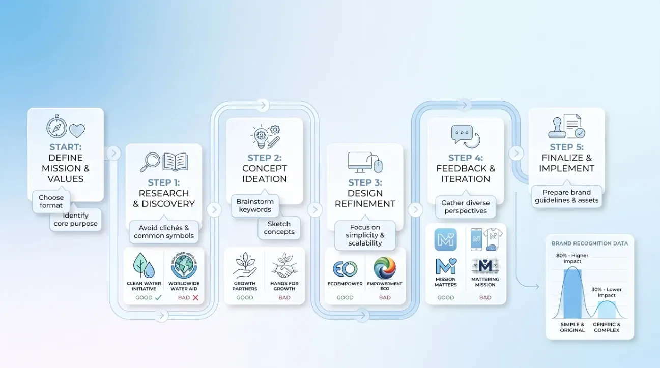
Calm infographic with a roadmap flow diagram for logo design, featuring light blue gradient, icons, and mini-logo examples.

Before colors or polish, decide on structure.

There are four formats a non-designer can reason about clearly:

  1. Wordmark: the full name set in a distinctive type, like the way many advocacy groups run their name alone

  2. Lettermark: initials only, which works when the name is long but risks meaning nothing until people learn it

  3. Symbol with a name: an icon paired with the wordmark, the most flexible option for a new organization

  4. Emblem: name and symbol locked into one shape, like a badge or seal, which reads as formal but shrinks poorly

Let the name's length and likely placements pick the format. Your mission and current recognition should guide your mission-driven logo design choice as well. A brand-new group nobody recognizes should almost never go symbol-only, because the icon carries no memory yet. Sketch several rough concepts on paper before committing to anything. Cheap exploration now saves expensive revision later.

Need help with your AI visibility?

Book a free consultation with our experts we'll help you determine exactly which services your organization needs.

Select meaningful symbols

If you use a symbol in mission-driven logo design, choose imagery with a clear line back to your mission and one your priority audience will read the way you intend. Check it for unintended meanings across communities. A shape that reads as neutral to your board can carry baggage somewhere else.

Favor one strong idea over a collage. The temptation is to pack everything into it at once. As Hyperakt's team put it, nonprofits reach for "a globe for global, a hand for help," because these shortcuts feel safe, "but they rarely make people stick around." One clear thought beats four muddy ones.

Avoid charity logo design clichés

Before you commit, look hard at familiar motifs such as cupped hands or hearts. The team at Heartspark Design asks the obvious question about charity logo design, "How many hands reaching upward," globes, or hearts have you already seen? These symbols are crowded.

So if you land on one, give it an original treatment. Handicap International, now Humanity Inclusion, built its "HI" initials into the shape of a hand, which turns a tired motif into something specific. That's the bar for good charity logo design: take the expected idea and do something only you would do with it. Line up your shortlisted charity logo design concepts against the logos of peer organizations and adjacent sectors. If yours disappears into the crowd, keep working.

The cost of blending in is real. Research in the U.S. found that just 20 well-known nonprofit brands account for over half of Americans' "favorite" charities. You're competing for attention against names people already know, and sameness makes that harder. Strong charity logo design is one of the few levers a small team can pull without a big budget.

Check originality early

Run originality checks before you refine anything. Search your organization's name and visually similar marks online. Then check the relevant trademark records. In the U.S., the free Trademark Electronic Search System (TESS) lets you run a basic "knockout" search for exact or near matches in your category.

Be careful with borrowed parts. Stock icons and AI outputs can carry licensing restrictions or turn up in someone else's logo. Bloomberg Law notes that AI outputs "may unintentionally incorporate elements" from existing brands, which raises your infringement exposure. When serious legal risk is on the table, get qualified legal advice rather than guessing.

Refine type and color

With the concept chosen, typography and color make it feel credible and appropriate. Skip the trend rules. What you want is a restrained palette and legible type that support the symbol and suit your audience. And here's the discipline that separates strong marks from fragile ones: evaluate the complete logo in one color first, before you let color carry any of the meaning.

Choose readable typography

Pick a typeface that keeps your name clear at the smallest size you'll actually use, in both print and on screen. Test how the type performs at use sizes rather than choosing a font because it "feels" compassionate or authoritative. A feeling isn't legibility.

Watch two traps. Overly decorative lettering falls apart at small sizes, and very thin weights vanish against busy backgrounds or in low-quality print. Both weaken recognition, and thin strokes hurt accessibility. If the name is hard to read in a browser tab, the font has already failed its main job.

Use color with purpose

Choose a limited palette that supports the impression you named in the brief. Look at your cause category and your competitors' colors, then decide whether to fit in or stand apart. Blue and yellow dominate social justice and housing nonprofits, for instance, so leaning on them buys familiarity at the cost of distinctiveness.

Be skeptical of tidy color psychology, because associations shift with culture and context. White reads as purity in much of the West but signals death and mourning across many East Asian cultures. Your audience evidence beats any universal chart. Then define versions for color and one-color uses, so the logo still works when your preferred colors aren't available.

Need help with your AI visibility?

Book a free consultation with our experts we'll help you determine exactly which services your organization needs.

Build in accessibility

Test the logo on varied backgrounds, and make sure no important distinction depends on color alone. That last point is practical, not abstract: roughly 1 in 12 men and 1 in 200 women have a color vision deficiency, so a mark that relies on red-versus-green to make its point will read as mush to a real slice of your audience.

Check contrast wherever the logo sits next to a background or contains text. Note that WebAIM points out text in a logo has no contrast requirement under WCAG. That requirement is a legal minimum rather than a design goal. Readable type and clear forms still decide whether people can actually use your mark. When nonprofit logo design appears as an image online, give it accurate alternative text so screen readers can announce it.

Test nonprofit logo design

Here's where most teams go wrong. They judge a logo in a polished slide and pick a favorite. Then it collapses in the wild. Sound nonprofit logo design testing moves shortlisted concepts into the real placements where you'll use them.

Use the same criteria for every option rather than asking which one people like best. Liking is a weak signal. Whether the mark works at 16 pixels is a strong one.

Test size and shape

Shrink each logo until it starts to break down. The standard browser-tab favicon is only 16 by 16 pixels, which is 256 total pixels to work with, so anything intricate turns to sludge. When the full logo fails at that small size, build a simplified version for tiny nonprofit logo design placements.

Then push the other direction. Enlarge the mark to ensure it stays clean, then test it in different spaces. A symbol should stand alone when your audience can connect it back to you; a new organization needs to build that connection first.

Gather useful feedback

Show viable options to a small group that reflects the community you serve. Ask participants what organization or cause they think the logo represents and what they remember about it an hour later.

That framing surfaces the problems that matter. If several people read your education logo as a bank, or keep mistaking your symbol for something unrelated, treat that repeated confusion as hard evidence. One person's dislike of a color is noise. A pattern of misreading is a signal you can't ignore.

Score each concept

Rate each nonprofit logo design option against the brief for how well it meets its goals.

Then run a short set of pass-or-fail gates:

  • Does it hold up in one color?

  • Is it clear at the smallest required size?

  • Do people interpret the symbol correctly?

  • Does it look uncomfortably close to another mark?

Write down why the winner beat the alternatives. That record does two things. It settles the room when someone relitigates the decision later, and it gives whoever inherits the brand a reason for the choice instead of a mystery.

Prepare usable logo files

The deliverable is a small, practical system of approved versions. A flawed system quietly sabotages everything you built. Require the versions needed for each use, including full-color and one-color files.

The format that keeps the whole system alive is vector. Because SVG files scale infinitely without losing quality, one file works on both a mobile header and a printed banner. Keep editable vector originals (SVG, EPS, AI, or vector PDF) and export practical PNGs for daily digital use. Then write a one-page guide that specifies how to use the mark, so staff and outside vendors apply the mark the same way every time.

Choose AI or designer

An AI-assisted Brand Builder is a reasonable route for an early-stage nonprofit with a limited budget. It suits a straightforward brief when the team has enough internal judgment to customize and test its output, and legal risk is low. It gets you moving fast and cheap, and for many small groups that trade-off is right. Professional nonprofit logo design work runs from $10,000 to $49,999 at agency rates, which is out of reach for most groups still finding their footing.

Hire a professional designer when the stakes climb. This includes work that touches sensitive communities or spans multiple cultures or languages. It also helps navigate complex stakeholder input. A professional designer is valuable for a major rebrand or high public visibility when you need distinctiveness and trademark confidence. There's also a legal reason to keep humans involved. The U.S. Copyright Office has said purely AI-generated content can't be copyrighted, and protection depends on genuine human authorship in the final work.

A hybrid path gives you the best of both. Use AI to explore directions quickly, then bring in a designer to refine the concept. The designer can verify the technical quality and prepare original, production-ready files. Whichever route you take, read the platform's terms before you rely on the output, since some tools grant full commercial rights while others restrict trademark use or retain ownership.

Nonprofit logo design checklist

Approve the logo only when it clears this list:

  • The brief is written, and the mark meets its stated goal

  • It fits the priority audience and carries the mission signal

  • The symbol reads the way you intended, with no unwanted associations

  • Originality and trademark checks came back clean

  • The typography stays legible at the smallest size, and the palette holds in color and one-color versions

  • It passes accessibility checks and doesn't rely on color alone

  • It scales cleanly and survives real placements from favicon to banner

  • Feedback showed recognition rather than confusion

  • You own or hold rights to every element used

  • Editable vector files (SVG, EPS, AI, or vector PDF) exist alongside practical PNG exports

Approve only logos that work in one color. They must remain clear at the smallest required size and retain recognition across your key placements. Get those right, and your nonprofit logo design will hold up for years. It will earn the trust your mission needs before a single word is read.

Conclusion

Strong nonprofit logo design requires a clear brief and a mark that works in real use. It also requires an honest read of your audience. Its files must keep working long after launch. Follow the sequence. Test in the places your logo will live. Document why you chose what you chose. That discipline is what turns a nice image into mission-driven logo design your supporters recognize and trust.

Whether you're creating a new organization or refreshing your existing brand, the right strategy makes all the difference. Contact the Snoika Foundation to discuss your project and find the best approach for your nonprofit's goals.
Need help with your AI visibility?

Book a free consultation with our experts we'll help you determine exactly which services your organization needs.

Set a budget after you define the uses, legal risk, and internal review time. A nonprofit logo design can start with a template or AI-assisted concept, while work for sensitive communities, multilingual audiences, or a major rebrand warrants funds for a professional designer and trademark advice.

Yes, if the license permits commercial and trademark use and the finished mark is distinctive. Check whether the template’s icon, font, and modifications are covered. Search for similar use before launch, since a widely reused template can weaken recognition and make trademark registration harder.

Alternative text should identify the organization and describe the symbol only when that detail adds meaning. For example, use “River City Food Pantry logo, a wheat stalk beside the name” rather than a filename. If the logo is decorative beside an identical text name, use an empty alt attribute.

Redesign when the current mark no longer represents your mission or fails in required placements. Repeated audience confusion is another reason to change it. Test the existing logo first, rather than starting from internal preference, because a new program doesn’t require a new identity when the current mark remains clear.

Have each board member score every concept against the written brief before discussing personal preference. Use the same criteria, such as legibility and audience interpretation, and record the result. Wepik’s AI-assisted Brand Builder can produce early directions, but the board should test them in real placements before approval.

Book a Demo

Book a time that works best for you

You Might Also Like

Discover more insights and articles

An airy infographic featuring a central 'Trust' card surrounded by translucent strategy steps, metrics, and icons on a blue gradient background.

Nonprofit Brand Strategy: A Step-by-Step Framework for Building Trust

This article lays out a reusable framework for defining what your organization stands for and proving your claims with evidence. It covers research through measurement.

Calm infographic showcasing 'Tailored AI Training for Nonprofit Staff' with role-specific cards and best practices in a clean layout.

AI Training for Nonprofits: A Practical Curriculum for Teams

This article lays out a curriculum for turning scattered AI experiments across your staff into shared, documented practice. It covers how to assess skills and risks and design role-specific learning.

Infographic illustrating the nonprofit donor journey with rounded cards for each stage, set against a light blue to white gradient background.

Donor Journey Mapping for Nonprofits: From First Contact to Long-Term Support

This article gives you a practical framework for donor journey mapping, from the moment someone discovers your cause through recurring support and advocacy. You will learn how to pick a priority persona and map each stage of the nonprofit donor journey. The finished map then becomes a guide for coordinated fixes across your website and email, with search and campaigns folded into the same effort.

A light blue infographic featuring a central translucent card labeled 'AI Policy for Nonprofits' with branching flowcharts and stakeholder silhouettes.

AI Policy for Nonprofits: A Practical Governance Template

This article walks you through building an AI policy for nonprofits based on what your staff already do. You'll get plain-language principles and use boundaries, with safeguards built into a copy-ready template and an implementation checklist you can adapt this week.