Nonprofit Brand Guidelines: What to Include and How to Use Them

Content authorArtem LozinskyPublished onReading time15 min read
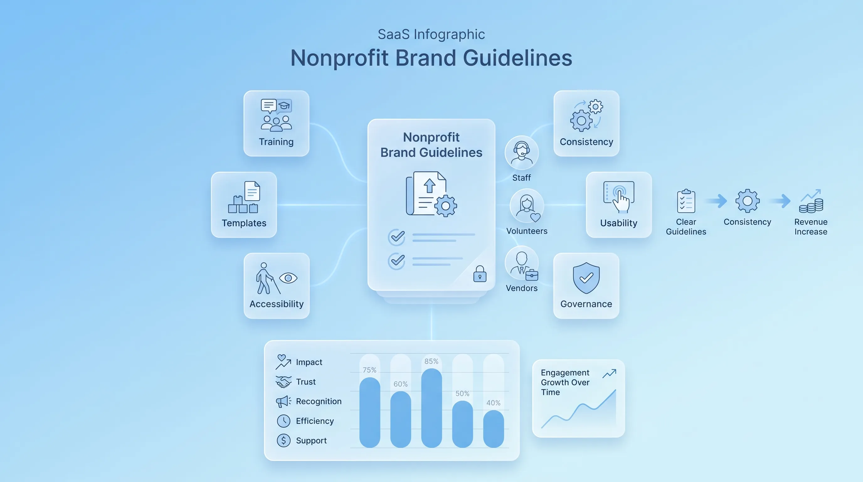
An airy SaaS infographic featuring a central translucent card labeled 'Nonprofit Brand Guidelines' surrounded by six smaller cards and a bar chart.

This article explains how to build nonprofit brand guidelines your team will actually open, from the audit that comes first to the governance that keeps the document alive. It covers what belongs inside and how to roll the whole thing out without hiring a brand manager.

Why a guide beats a gut check

Nonprofit brand guidelines exist to settle arguments before they start. When a volunteer builds a flyer at 9 p.m. and a grant partner drops your logo into their annual report, nobody is calling you for approval. They're making a judgment call, and the quality of that call depends entirely on what you wrote down.

The gap between having nonprofit brand standards and using them is where most of the damage happens. Demand Metric's benchmark study with Lucidpress found that 95 percent of organizations have nonprofit brand guidelines, but only a quarter enforce them consistently. The same study reported that guidelines rated poorly were almost never easy to find, with just 9 percent of that group saying so.

The problem is usability, and that's what this guide is built around.

Audit your current brand

Start by collecting everything your organization has published in the last twelve months. Pull the website homepage and a program page. Gather the last two email appeals and the most recent annual report. Add a board deck and a stack of social posts. Include whatever flyers are sitting in the supply closet. Print them or drop them into one shared folder where you can see them side by side.

What you're looking for is drift. Count how many logo variants show up and how many fonts. Note where the tone shifts from warm to bureaucratic between a donor letter and a program page. Write each inconsistency down as a decision the nonprofit brand guidelines will have to make, because a guide that avoids the hard calls just moves the argument somewhere else.

Then talk to the people who touch the brand most. That's rarely the executive director. It's the development associate who builds every appeal and the volunteer who runs Instagram. Ask them one question: what do you have to guess about every time you make something? Their answers become the table of contents.

Before drafting, settle these:

  • Which logo version is the default, and what happens when the background is dark or the space is tiny

  • Whether the organization writes as "we" or in third person, and whether program names take capitals in the nonprofit style guide

  • Who approves a piece before it goes public, and which pieces skip approval entirely

Structure the document

Aim for 10 to 20 pages. Anything shorter leaves too many gaps for a lean team to fill on instinct, and anything longer stops being a reference and becomes a book nobody finishes. The nonprofit brand guidelines that get used are the ones organized around tasks.

A workable order starts with brand foundation first (mission and what the brand is for in two pages), then visual identity. Cover verbal identity and accessibility before how the rules apply per channel. Close with templates and governance. The charity: water brand book follows this shape and dedicates its final sections to editorial rules and specific brand terminology, which is exactly the material a writer needs from a nonprofit style guide at 4 p.m. on deadline.

Lead every section with an example and put the explanation underneath. A person opening your nonprofit style guide wants to see the correct version of the thing they're making. Give them that on sight, and they'll read the reasoning only if they need it.

Build nonprofit brand guidelines

The test for every rule you write is simple. Can someone who has never opened Illustrator follow it without emailing you? If the answer is no, the rule needs a picture or a file link attached to it. That's the standard this section applies to each component.

Logo and spacing rules

Document every approved version: primary and horizontal. Cover stacked and icon-only, then one-color and reversed white. For each one, say where it belongs. The icon-only mark is for social avatars and favicons. The horizontal lockup is for email signatures and letterhead.

Clear space is where most amateur layouts fall apart. Set it as a ratio of something inside the logo (the height of the wordmark's capital letter is a common anchor) so it scales automatically instead of requiring a calculation. Give a minimum size in pixels for screen and in inches or millimeters for print, then say plainly what breaks below it.

Show the wrong versions, too. Stretched or recolored, and placed on a busy photo. A do-and-don't grid in the nonprofit brand guidelines teaches faster than a paragraph. And every logo section needs live download links to PNG and SVG files, because a person who can't find the right file will screenshot the one on your website.

Co-branding deserves its own page. State how your mark sits next to a funder's and which of the two leads. Nathalie Laidler-Kylander and Julia Shepard Stenzel, in their book The Brand IDEA, describe organizations with high brand affinity as ones that work well with other organizations and their brands, "sharing space and credit generously." Your co-branding rules are where that generosity becomes concrete.

Need help with your AI visibility?

Book a free consultation with our experts we'll help you determine exactly which services your organization needs.

Colors and typography

Give every color four values: HEX for web and RGB for screen design. Add CMYK for process printing and a Pantone reference for anything a commercial printer touches. That last one isn't decoration. Spot colors are pre-mixed inks that reproduce the same shade batch after batch, while CMYK builds color from four inks and shifts between print runs. Without a Pantone number in the file, your printer picks one for you.

Split the palette clearly. Primary colors carry the identity and dominate. Secondary colors support charts and program sub-brands. State the approximate proportion you want, something like 70 percent primary and 30 percent everything else, so nobody builds a purple annual report because purple was on the page.

Typography needs the same treatment. Name the display face and the body face, then name the fallback for anyone without the licensed font installed, because a volunteer working in Google Docs cannot install your paid typeface. Set the hierarchy with actual numbers. Body copy on the web sits at 16px minimum, with line height of 1.5 and line length capped at 75 characters, since reading speed drops once lines run long.

Imagery and iconography

Photography is where a nonprofit brand either earns trust or quietly spends it. Define the subjects you photograph and the angle you shoot from. The advice from NonprofitPro's guide on ethical storytelling is blunt about one habit: shoot at eye level when photographing people experiencing homelessness, because shooting from above portrays an explicit power dynamic and minimizes their humanity. Write that in the guide.

Consent needs a paragraph. Guidance from the Lampkin Foundation on ethical nonprofit storytelling holds that consent should be informed, voluntary, specific, and ongoing, and that agreeing to speak with a staff member isn't the same as agreeing to become permanently searchable online. Your nonprofit brand guidelines specify what your release form covers and who to ask when a photo gets reused for a campaign years later.

Set the technical rules alongside the ethical ones. Which crops are allowed and whether filters are permitted (the answer is no beyond light exposure correction). For icons, pick one style with one stroke weight and stick to it, then link to the source library so nobody mixes a filled icon set with an outlined one on the same slide.

Nonprofit style guide essentials

Voice traits are useless as adjectives alone. "Warm and direct" tells a writer nothing until you show it. Pair each trait with a sentence you'd publish and a sentence you wouldn't, so the difference is visible. Zeffy's nonprofit style guide makes the same recommendation: include sample sentences that capture your tone plus counter-examples of how you don't sound.

Tone shifts with audience while voice holds steady. A donor thank-you and a crisis statement come from the same organization but land differently, so name the two or three situations where your team writes most and describe the adjustment for each. Then handle terminology: how program names are capitalized and which acronyms you spell out on first reference.

Inclusive language belongs here. The Associated Press Stylebook, in its 56th edition, advises that when individual or group preferences can't be determined, writers should use a mix of identity-first and person-first language, and that a person's disability should be mentioned only when relevant. Pick your defaults and note where you deviate from AP.

Make accessibility standard

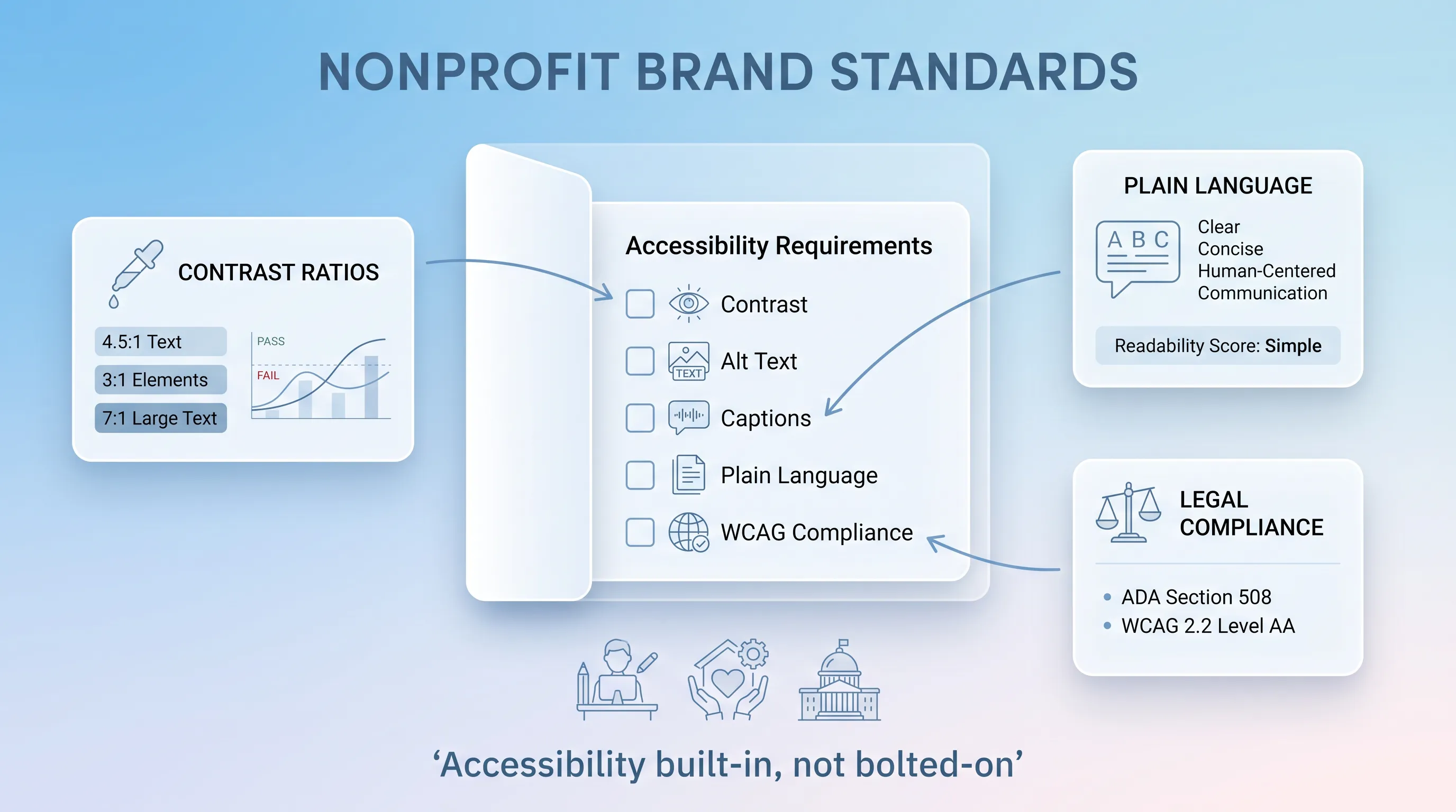
Calm infographic featuring a central 'Nonprofit Brand Standards' card with checkboxes for accessibility, surrounded by mini-cards and icons.

Accessibility fails when it's the last checkbox before publishing. Treat it as part of your nonprofit brand standards and the problem solves itself upstream, because the palette you approved and the type sizes you specified already meet the bar.

The scale of the failure is well documented. The 2026 WebAIM Million analysis of the top million home pages found low-contrast text on 83.9 percent of them, up from 79.1 percent the year before, with an average of 34 distinct instances per page. That's the single most common accessibility error on the web, and it originates in brand palettes that were chosen on a designer's calibrated monitor and never tested.

Write these into your nonprofit brand standards as requirements with numbers attached:

  1. Body text meets a contrast ratio of at least 4.5:1 against its background, per WCAG Success Criterion 1.4.3, with 3:1 permitted for text at 18pt or 14pt bold and larger.

  2. Every informative image carries alt text describing what it conveys, while purely decorative images get a null alt attribute so screen readers skip them instead of announcing a filename.

  3. Video carries captions that are accurate, synchronized, and include speaker identification and non-speech sound, which follow the DCMP Captioning Key standard.

  4. Link text describes the destination, and PDFs are tagged with a reading order before they're posted.

Plain language rounds this out. The federal government has required it since the Plain Writing Act of 2010, which obligates agencies to write documents the public can understand and use. You aren't a federal agency, but your donors and program participants read the same way theirs do. There's also a legal current running here: the Department of Justice's 2024 Title II rule set WCAG 2.1 Level AA as the standard for state and local government digital content, and any nonprofit that contracts with those agencies will feel that requirement flow downhill.

Need help with your AI visibility?

Book a free consultation with our experts we'll help you determine exactly which services your organization needs.

Apply rules across channels

The core identity stays fixed. What changes is emphasis, and the guide states how. On the website, the full logo sits in the header and the primary color drives navigation and buttons. On social, the icon-only mark takes the avatar slot and the color carries the recognition instead, since a wordmark at 40 pixels is a smudge.

Annual reports get more white space and a wider type scale because they're read slowly. Presentations need the opposite: larger type and high contrast that survives a washed-out projector in a church basement. Email is its own animal, where web-safe fallback fonts matter more than your licensed display face and a single-column layout beats anything clever.

Give each channel a short spec. Logo version and dominant color. Include type sizes and image ratio, with one line about what the piece feels like. Two or three sentences per channel is enough when the visual identity section of the nonprofit brand standards has already done the heavy work.

Create usable templates

Templates are where nonprofit brand guidelines stop being a document and start being a habit. Prioritize the work that repeats and gets made by people outside the comms function: social post sets and email signatures. That last one takes fifteen minutes to build and eliminates a category of inconsistency forever.

Canva is the practical home for most of this. Registered nonprofits get all Canva Pro premium features free for a team of up to 50 users, with a Brand Kit that stores logos and colors and applies them automatically. Over a million nonprofits already use it, which means your volunteers know the interface before you train them.

Be explicit about what's editable in the nonprofit brand guidelines. Lock the logo placement and the color values. Open up the headline copy and the body text, along with the photo slot and the call to action. Put a short note directly in the template file, so the instruction travels with the asset.

Prevent common mistakes

A page of before-and-after pairs in the nonprofit brand guidelines prevents more errors than a page of prohibitions. Show the mistake at actual size next to the fix and let the difference do the teaching.

The recurring offenders are predictable. A logo stretched to fill a box instead of scaled proportionally. A color eyedropped from a JPEG that lands two shades off the real HEX value. Grey text on a light background that looked elegant on a retina display and disappears on a phone in daylight. A deck built in Arial because the licensed font wasn't installed and nobody knew the approved fallback.

Then there are the softer failures. Stock photography of anonymous smiling people that has nothing to do with your programs and everything to do with a deadline. A tone that reads as clinical in a grant report and giddy in the newsletter two days later. Old templates still circulating because someone saved a copy to their desktop in 2022. Channel designs that each look fine alone and look like four organizations when placed together.

For each one, name the fix in a single line. Scale with shift held. Use the HEX from page 9. Run the pair through a contrast checker before you export.

Govern nonprofit brand guidelines

Someone owns the nonprofit brand guidelines by name and title, or they decay. That owner approves exceptions and holds the master files. Name a backup, because comms roles in this sector turn over and an orphaned guide is a dead guide.

Set a tiered approval model in the nonprofit brand standards so routine work doesn't queue behind a bottleneck. Social posts built from an approved template need no review. Anything with a new logo lockup or an external-facing report goes to the owner. That distinction is what keeps oversight from becoming a tax on a team that doesn't have the hours to pay it.

The infrastructure is boring and it matters:

  • One central location for assets, linked from the guide itself

  • A file naming convention that includes organization and asset type, so "logo-final-FINAL-v3.png" stops happening

  • A version number and revision date on the guide's cover, with an archive folder for superseded versions

  • A scheduled review date, once a year at minimum, with an earlier trigger if you launch a program or rebrand a campaign

Roll out the guide

Train by role. Program staff need thirty minutes on templates and photo consent. Development needs voice and the fundraising templates from the nonprofit style guide. Vendors and design contractors need the file links and the technical specs and little else.

Give everyone a one-page quick reference: logo files and HEX codes. Include fonts and the contrast rule, with the name of the person to ask. That single page will get used a hundred times for every one time someone opens the full document, and that's a success.

Volunteers deserve particular attention here, since they produce a lot of public-facing material and receive the least onboarding. Independent Sector and the Do Good Institute put the value of a volunteer hour at $36.14 in 2025, a 3.9 percent rise over the prior year. Time spent teaching them the rules is time that compounds.

Then build the feedback loop. One inbox or form where anyone can flag a rule that doesn't work or a case the guide missed. Audit a sample of live materials twice a year against the nonprofit brand standards, and fold what you learn into the next revision. Kivi Leroux Miller, founder of the Nonprofit Marketing Guide, publishes annual data on how nonprofit teams update brand and style guides, and her 2024 report tracked exactly those changes across brand guides and websites. Guides that get revised are guides that get followed.

Get expert support

Consistent brand presentation across platforms is associated with a 23 percent revenue increase, according to Lucidpress research, and that discipline starts with nonprofit brand guidelines people can actually apply.

Snoika Foundation builds brand identities for nonprofits through its AI-driven Brand Builder, which produces a complete kit covering logo and color palette, ready for your website and campaigns. If your team is guessing more than it should, book a call and we'll help you turn scattered assets into nonprofit brand guidelines your whole organization can use.
Need help with your AI visibility?

Book a free consultation with our experts we'll help you determine exactly which services your organization needs.

Track whether staff and volunteers use the current templates, correct logo files, and approved colors without repeated corrections. Review a defined sample of public materials twice each year, then record the errors that recur. If the same question keeps appearing, add a clearer example or instruction to the nonprofit brand guidelines.

Use a separate program brand only when the program serves a distinct audience or must operate with its own public identity. Otherwise, keep the organization’s logo, voice, and core colors visible. Give the program a named color or template treatment so audiences can recognize it without mistaking it for a separate organization.

Yes, partners can use your logo when you give them approved files and written placement rules. Provide the correct logo version, clear-space requirement, permitted background colors, and a contact for unusual uses. Ask partners to send co-branded materials for review when the piece represents both organizations publicly.

Set a crisis approval path before an urgent situation occurs. Name one primary approver and one backup, then prepare a short holding-statement template that staff can adapt. The message should use the organization’s normal voice, state verified facts only, and identify when the next update will be available.

Get outside help when your team lacks the time or design skills to resolve repeated inconsistencies. Snoika Foundation is an option named in the article. Its AI-driven Brand Builder produces a kit with a logo and color palette, which a team can use as a starting point for its own documented rules.

Book a Demo

Book a time that works best for you

You Might Also Like

Discover more insights and articles

Infographic with a glassmorphism style, featuring a 9-step process in three rows, with elegant blue-and-white icons and flowing connections.

How to Build AI-Ready Program Pages That Convert

This article explains how to rebuild a programme page as an AI-ready program page structure so that a prospective participant and a language model can work out in seconds what you do and whether it applies to them. It walks through a nine-block architecture and a publishing workflow you can run with a small team.

Modern infographic with soft blue gradient background, featuring four circular glassmorphism cards connected by subtle lines and icons.

Nonprofit Call to Action Examples for Donations, Volunteers, and Advocacy

This article is a working swipe file of nonprofit call to action examples you can adapt for donations and volunteer recruitment. It covers copy formulas and a simple testing method so you can replace vague asks with ones that actually get completed.

Modern B2B technology infographic with frosted-glass cards, soft blue gradient, and elegant connections, centered on "Brand Guidelines.

Nonprofit Brand Identity: How to Build a Consistent System Beyond the Logo

This article explains how to build a nonprofit brand identity that survives contact with reality: twelve staff members and no in-house design team. It covers the visual and verbal systems behind that consistency, plus the templates and governance that keep the whole thing alive after launch.

Flat design infographic comparing two donation website types: 'Visit-to-Donation Rate' on the left and 'Start-to-Completion Rate' on the right, with arrows i…

Donation Page Conversion Rate: Formula, Benchmarks, and Diagnostics

This article explains how to calculate and benchmark a donation page conversion rate without mixing up denominators. It walks through two formulas with worked numbers and a repeatable diagnostic sequence you can run before you change anything on the page.