Evidence-Rich Resource Hubs for Sustainable Search Presence

Content authorArtem LozinskyPublished onReading time11 min read
A large central browser panel surrounded by rounded UI cards with icons, set against a soft blue gradient background, conveying digital connectivity.

This article helps you decide whether your organisation's research and evaluations justify building a resource hub architecture, and if so, how big that hub should be. It compares formats and realistic costs, then ends with a worksheet for making the call.

Start with the problem

Most conversations about resource hub architecture start in the wrong place: a format someone liked on another website. Start instead with what's going wrong now. Four reports scattered across news posts and a specialist audience that keeps emailing to ask for a document already published in 2022.

Those are symptoms, and they point in different directions. Fragmented content means the material exists but nobody can assemble it. Repeated enquiries mean the material is findable in theory but invisible in practice. Outdated resources with no review date quietly damage the credibility you spent years building, which is the part of long-term authority building nobody budgets for.

Compare resource hub architecture

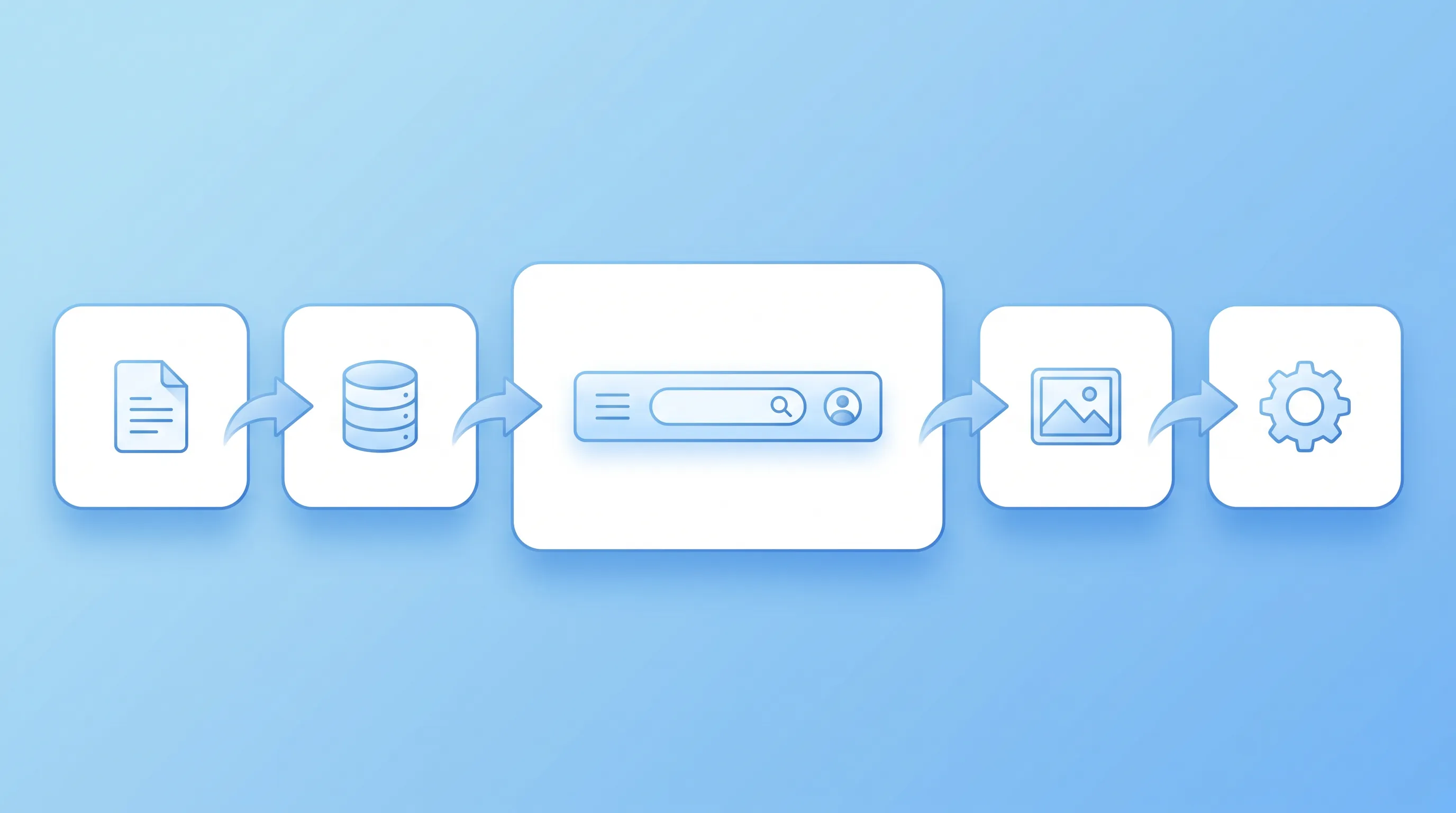
A minimalistic infographic panel featuring a linear arrangement of soft blue icons representing resource types, connected by arrows.

Four options are available, and one of them involves building nothing new. Before choosing, count what you actually have: the number of published items and the hours per month someone can realistically dedicate to maintenance.

Improving existing navigation is the simplest option for organisations with fewer than 15 items, one main audience, occasional editorial capacity, no technical needs beyond CMS edits, and low maintenance requirements.

A resource landing page suits organisations with 10 to 30 items, one or two audiences, a few hours of editorial capacity per month, and the need for a templated page. Maintenance remains low.

A topic-led hub is more appropriate for organisations with 30 to 120 items, two or three audiences, around half a day of editorial work per week, and technical requirements such as a taxonomy and listing pages. This option involves moderate maintenance.

A searchable evidence centre is designed for organisations with more than 120 items serving policy, practice and research users. It requires a dedicated role, technical infrastructure such as a metadata schema and search index, and a high level of ongoing maintenance.

The honest answer for many organisations is the first option. If your reports are already published and the problem is that nobody can find them from the homepage, improving the navigation and adding a clear index can solve the issue within a fortnight. Financial pressure makes this restraint rational: 69% of charities identified squeezed budgets as their biggest barrier to digital progress in the 2025 Charity Digital Skills Report.

Resource landing page

A curated page works when the collection is small and aimed at people who already know roughly what they want. You list each item with a short description and a date, and you keep the whole thing on one URL. The editorial job is manageable because one person can hold the entire collection in their head.

Limits appear fast. Past roughly 30 items the page becomes a scroll, and the moment a second audience arrives with different questions, your ordering serves one group and frustrates the other. Adding a filter at that point is a patch.

Topic-led resource hub

Topic navigation carries a growing collection without search infrastructure. You define six to ten topics in the language your audiences use and give each one a page that explains the topic before listing the evidence. No metadata schema, no indexing layer.

This is the option most organisations underrate. It supports long-term authority building because each topic page accumulates relevance over time instead of being a container that empties and refills. The constraint is discipline: if every new report invents a new topic, you'll have 28 topics within two years and the resource hub architecture collapses.

Need help with your AI visibility?

Book a free consultation with our experts we'll help you determine exactly which services your organization needs.

Searchable nonprofit evidence center

Structured search earns its cost when the collection is large enough that browsing fails and the audiences want genuinely different cuts of the same material. A nonprofit evidence center at that scale needs filters that match how people actually narrow down. Nielsen Norman Group's guidance on filter design is blunt about what makes them work: categories that are appropriate, predictable.

The scale reference point is 3ie's Development Evidence Portal, which holds more than 11,000 impact evaluations alongside around 1,000 systematic reviews. You probably don't have that. What you should take from it is the demand side: structured search only pays when every record carries consistent metadata, which means someone is extracting and checking fields for every single item. A nonprofit evidence center also needs governance, because inconsistent tagging degrades search faster than missing search degrades browsing.

Choose an organising principle

Five organising models compete here. Topics group by subject matter. Programmes group by what your organisation funds or runs. Places group by geography. Audiences group by who's reading and practical questions group by the decision someone is trying to make.

Programmes are the tempting choice and the wrong one, because programme names are internal vocabulary with funding cycles attached. Dan Brown, author of Information Architecture Lenses, offers a useful test that asks whether the navigation makes sense on another website. If your categories would mean nothing to someone outside the organisation, they mean nothing to your users either.

Write the resource hub architecture from user needs instead. The GOV.UK content guidance frames each one in a three-part template. Run that exercise on your ten most-requested documents and the organising principle declares itself. Most of the time it's a mix: topics as the primary structure, with a practical-question entry point layered on top for people who arrive mid-decision.

Set resource entry standards

Decide what qualifies as a resource before you build anything, because the alternative is a resource hub architecture that absorbs every PDF anyone has ever produced. Research summaries and evaluations each do a different job. A press release does not.

Every entry needs the same fields, filled the same way, by whoever publishes it:

  • Description: two or three sentences in plain language, written for someone who hasn't read the full document

  • Topic and format: chosen from your fixed list, never invented at upload

  • Source and dates: who produced it, when it was published, and when it was last reviewed

  • Owner: the named person responsible for this entry, not a department

  • Limitations: sample size, geography, time period, and what the evidence does not show

  • Provenance: whether this is your organisation's own evidence or independent research you're curating

That last field matters more than it looks. Mixing your own evaluations with external studies without labelling the difference invites a reasonable reader to discount both. Google's own quality guidance puts trust at the centre of its page quality framework, and transparency about who produced what is the cheapest trust signal you own. For datasets, the Dataset markup also requires a genuine 50 to 5,000 character description, so writing a real summary serves two purposes at once.

Need help with your AI visibility?

Book a free consultation with our experts we'll help you determine exactly which services your organization needs.

Design useful resource pages

Three page types, three distinct jobs. The overview page explains what the collection covers and routes people onward. The category page lists and filters within one topic. The individual resource page answers the question without requiring a download.

That last point is where resource hub architecture fails. Jakob Nielsen and Anna Kaley of Nielsen Norman Group concluded after two decades of testing that PDFs are unfit for human consumption in digital contexts, and recommended an HTML gateway page that summarises the key points before offering the file. A grid of PDF thumbnails with titles and nothing else forces every visitor to download before they can judge relevance.

Build the resource page instead around an accessible summary of 300 to 500 words and clear download details. GOV.UK's link guidance is specific about this and tells publishers to include the file format and size when linking directly to a document. Add two or three related items at the foot of the page and you've turned a dead end into a path. Accessibility is part of the same decision, since documents published only as PDFs frequently fail the 4.5:1 contrast ratio and screen reader requirements that your web pages already meet, and publishing important information as an accessible web page rather than a file is easier to maintain anyway.

Assign ongoing ownership

A resource hub architecture without a named owner becomes an archive of broken promises within three years. Pew Research Center found that 38% of webpages existing in 2013 had vanished by late 2023, and that 21% of government pages already contain at least one broken link. Your outbound citations will rot at a similar rate whether or not anyone is watching.

So assign four responsibilities explicitly. One person approves publication. One person runs a scheduled review of every entry, annually at minimum. Someone checks links quarterly, and someone resolves version conflicts when a 2023 briefing contradicts a 2026 evaluation.

Labelling matters as much as checking. Cochrane marks reviews it no longer updates as stable rather than deleting them, which preserves the record while telling readers where things stand. Borrow the distinction: withdrawn material comes down with a note explaining why, and superseded material stays up with a prominent link to the current version. Maintenance capacity is the real ceiling on any nonprofit evidence center, and long-term authority building collapses the moment people stop trusting the dates on your pages. The maintenance hours you can commit to should set the size of your hub.

Evaluate the investment

Three routes exist, and the cheapest one is sufficient. Improving existing website navigation sits in the effort range of one person for two to four weeks. Internal delivery of a topic-led resource hub architecture costs you staff time rather than cash, but the time is real and underestimated by half.

External support brings published price signals. Fifty and Fifty's 2026 guidance puts a focused nonprofit redesign at $15K to $50K for smaller organisations, with mid-sized custom builds at $50K to $100K. UK figures from Circular Design track similarly, with a basic refresh at £2,000 to £5,000 against £15,000 and upwards for full-scope work that includes a WCAG audit.

Those headline numbers hide where the hours actually go. Preparation and content auditing consume more effort than design. Migration scales with the number of items and the state of your metadata, and accessibility work and staff training are the lines cut from a proposal and then paid for later. A searchable nonprofit evidence center sits at the top of every one of these categories at once, which is the real argument for starting smaller.

Launch a focused version

Pick one topic. Choose the one where you hold the strongest evidence and field the most enquiries, then publish a limited collection of 12 to 20 high-value items rather than everything you've ever produced. A narrow hub that's current beats a comprehensive one that's half-rotten, and it gives you a working model of the resource hub architecture before you commit to the full build.

Work through this before launch and after:

  1. Confirm the topic, the audience need and the named owner

  2. Write entry records for every item with limitations and review dates

  3. Publish summaries as web pages, with files offered as downloads rather than as the only route in

  4. Run an accessibility check on the new pages and on any document you're keeping as a file

  5. Set the review calendar and the quarterly link check before launch day, not after

  6. Train whoever will publish item number 21

Completion means every item has a summary and an owner. Then measure resource views and downloads, and external references to your pages. That last measure is the one that compounds, because citation by other organisations is what long-term authority building actually looks like from the outside. Semrush's analysis of 230,000 prompts across 13 weeks found how volatile AI citation patterns are, which makes a well-structured nonprofit evidence center with clean summaries and stable URLs a sensible hedge.

Make the final decision

Answer six questions in writing. What specific need does this meet, and for whom? How many items do you hold today? Which format of resource hub architecture fits that volume honestly? Who owns publishing and review by name? What budget exists through year two? How many hours per month can you commit to maintenance?

If the sixth answer is under four hours, build the smaller thing.

Snoika Foundation works with NGOs and public institutions to make their published evidence findable and citable in both Google and AI search for long-term authority building. Book a call with our team before you commit to resource hub architecture.
Need help with your AI visibility?

Book a free consultation with our experts we'll help you determine exactly which services your organization needs.

Measure changes in findability and usefulness, not page visits alone. Record baseline searches, enquiries for existing documents, resource-page views, downloads, and referrals from other sites. Review the figures after three months, then compare which topics attract visits but fail to lead users to related resources.

Choose one page as the main entry point and connect the other resource to it. Keep separate pages when the audience, evidence, or decision differs. Add a short explanation of the relationship, use consistent titles, and redirect retired duplicates so search engines and readers encounter one clear version.

Remove a resource when its findings are unsafe to apply, its source is invalid, or a replacement fully covers its purpose. Otherwise, keep the page and label it as withdrawn or superseded. State the reason, date the change, and link to the current resource when one exists.

Ask people from each intended audience to complete realistic tasks, such as finding evidence about a topic or comparing two evaluations. Record where they hesitate, which labels they misunderstand, and whether they can judge relevance without downloading a file. Fix repeated problems before adding more content.

Yes. An outside partner can compare your evidence volume, audience needs, publishing process, and maintenance hours before recommending a format. Snoika Foundation works with NGOs and public institutions on findable, citable evidence, so a call with its team can help test the decision before you commit budget.

Book a Demo

Book a time that works best for you

You Might Also Like

Discover more insights and articles

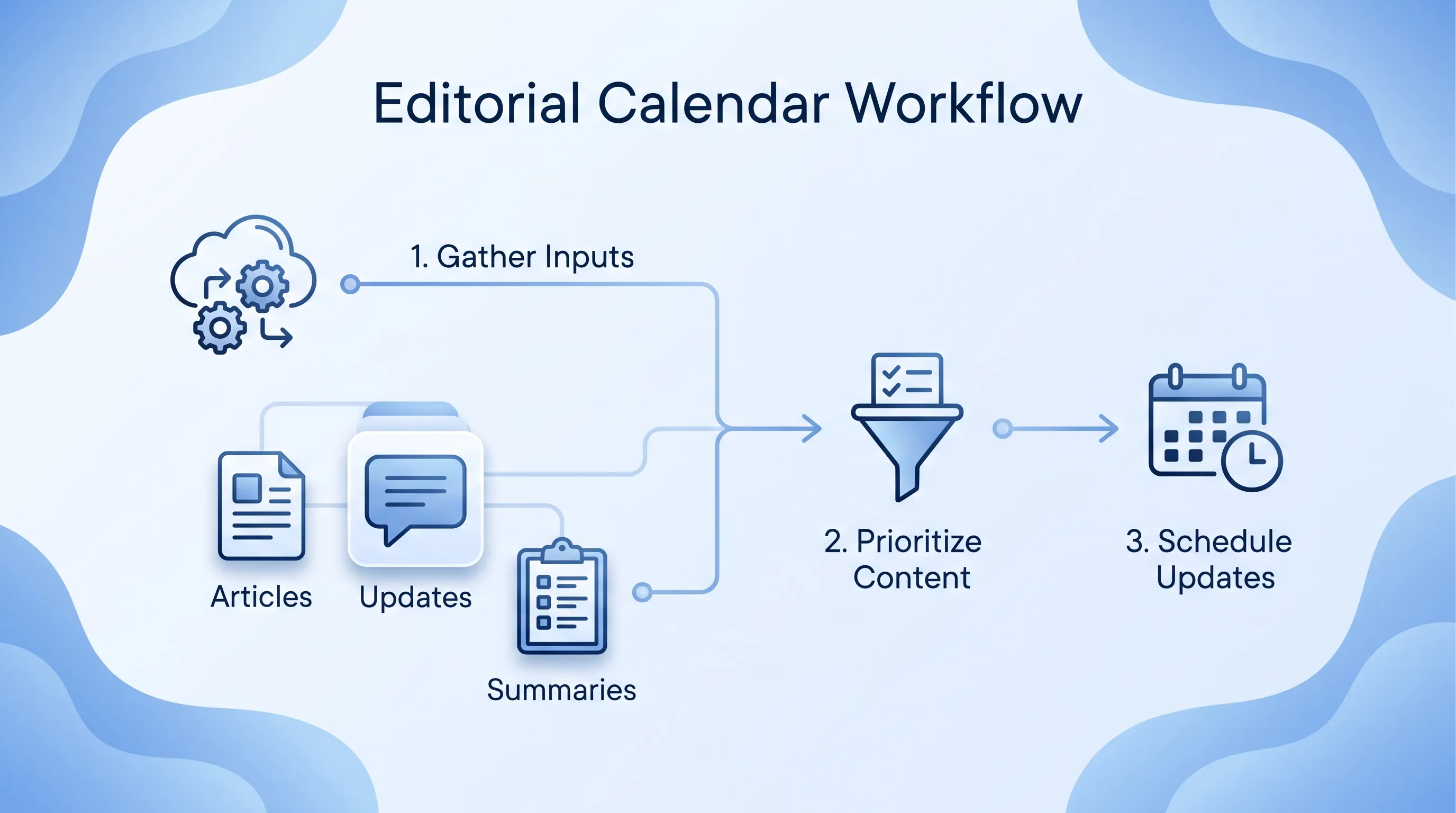
A diagram of an editorial calendar workflow in blue shades, featuring interconnected icons and labeled steps in a modern, clean style.

AI-Powered Editorial Calendar for Continuous Visibility

This article explains how a small communications team can plan publishing and maintenance in one spreadsheet that follows documented reader demand instead of the awareness-day treadmill. It covers inputs and prioritisation. A worked four-week example and the review questions worth asking at month end follow.

Modern infographic illustrating a central browser interface for nonprofit competitive intelligence, surrounded by symbolic blue icons and connectors.

Competitive Visibility Monitoring for Mission Organizations

This article explains how to check whether your organisation shows up, and shows up accurately, in search results and AI-generated answers about your cause. It covers a question registry and a coding method two reviewers can reproduce, plus a share calculation with defined denominators that shows the point at which paid software earns its cost.

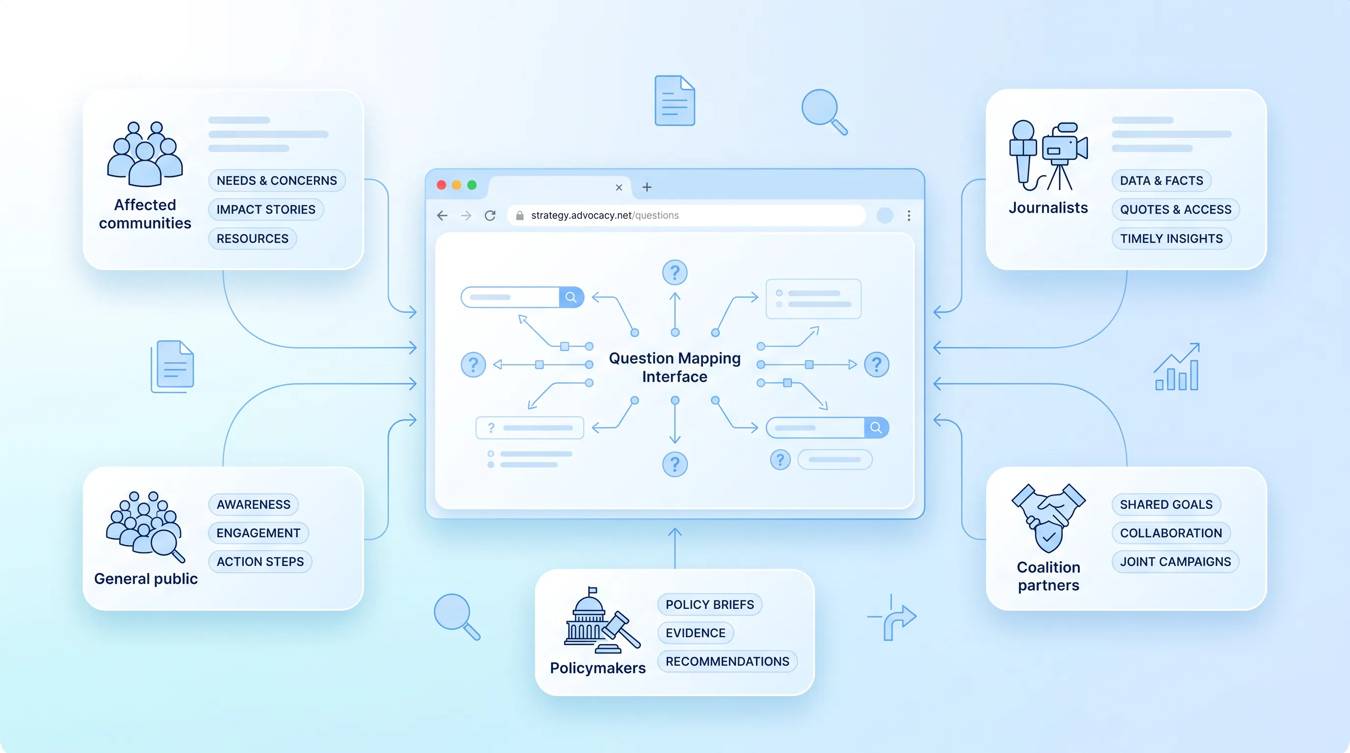
Modern infographic depicting an advocacy content strategy with a central browser window, user group icons, and a soft blue gradient background.

Advocacy Content SEO for Policy and Public Education

This article sets out a practical framework for planning and measuring policy pages so that facts and organisational positions stay separate on the page. It covers question mapping and evidence ranking through an outcome worksheet for ethical evidence publishing built around one clearly fictional proposal.

A modern infographic featuring a central web browser window with a multilingual AI dashboard, surrounded by blue line icons on rounded cards.

Multilingual AI Visibility Roadmap for International Missions

This article sets out a prioritized way to decide which languages your organization publishes in and what a complete reader journey looks like in each one. It covers language scoring and localization briefs, then hreflang structure and review gates, along with measurement by language and geography.